Introduction to jamma
James M. Ward
2023-06-26
Source:vignettes/jamma-vignette.Rmd
jamma-vignette.RmdIntroduction to jamma
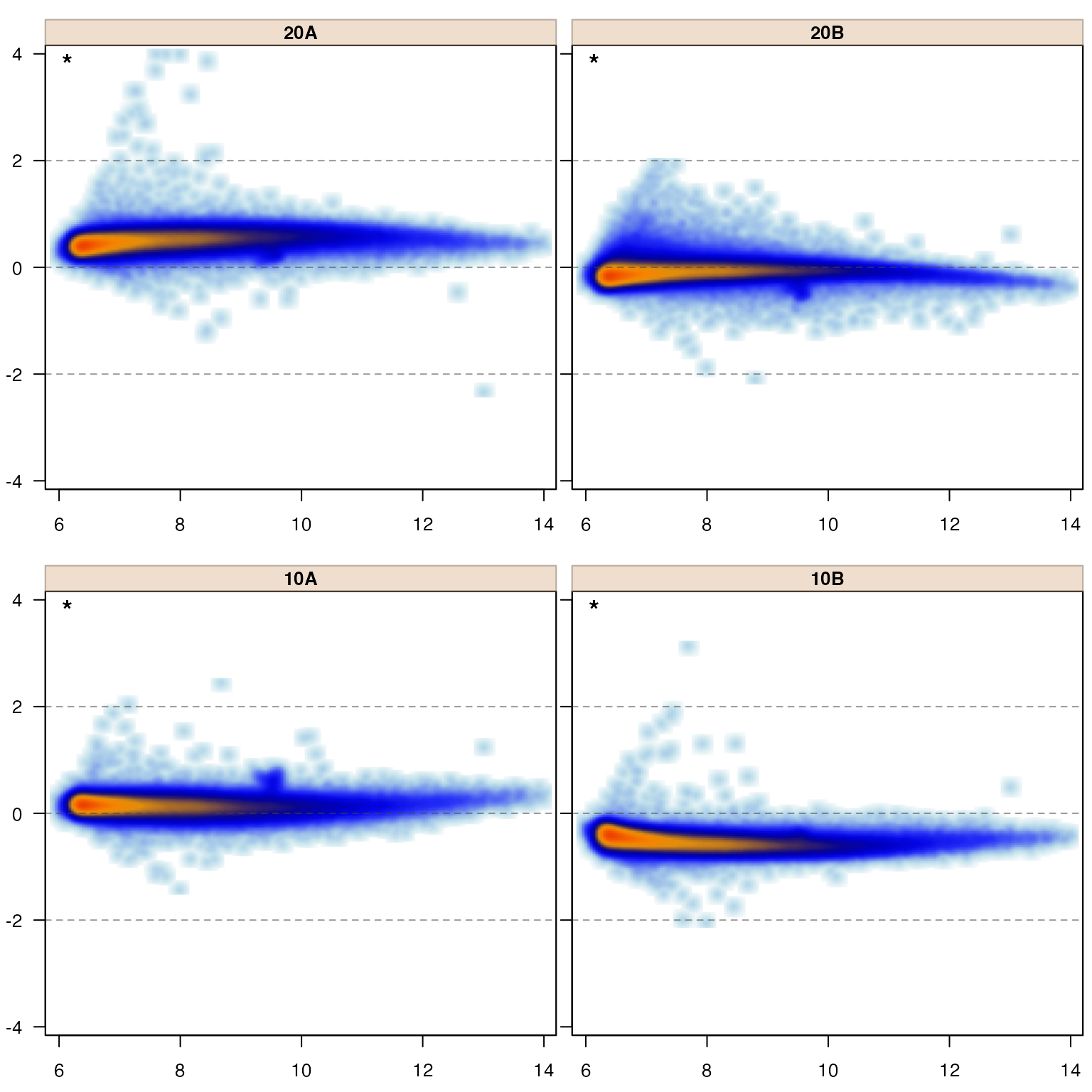
The jamma package is primarily intended to produce MA-plots, a special form of Bland-Altman plot applied to genomics or omics data, typically representing log2-transformed expression measurements form DNA or RNA microarrays, RNA-seq counts, or other expression measurements.
MA-plots have great utility as a data quality control (QC) methodology, as they effectively depict several aspects of data directly related to common downstream statistical assumptions. They can make it easy to recognize an obvious sample failure, or similarly to identify when one or more samples are not properly normalized, relative to downstream analysis steps.
That said, MA-plots often suffer from ineffective display of tens of thousands of datapoints, and so this package was motivated initially simply by the desire to display the density of datapoints rather than each individual point. It evolved to provide specific benefits, driven by a large number of analysis projects across several different platform technologies.
The jamma package also contains helper functions used to create and manipulate MA-plots which have been quite useful. This vignette demonstrates MA-plots, the various alternate ways of displaying MA-plot data, and the usefulness or the helper functions.
MA-plot content
MA-plots show difference in log2 signal from average, as a function of average log2 signal. Typically one creates MA-plots to compare multiple samples, but one can compare sample groups using group mean values. The typical MA-plot for our purpose will display an individual sample in each panel.
The visual distribution of points is intended to show the spread of points from low to high expression along the x-axis, and the deviation from mean along the y-axis. The relationship of signal (x-axis) to noise (y-axis) is a visual indicator of several characteristics of the data, and impacts the choice and effectiveness of numerous downstream statistical tests. The review of numerous panels of MA-plots can also be an effective way to judge the consistency of data from the samples and sample groups.
Interpretation of MA-plots
MA-plots display several really useful features which tie directly into many of the assumptions of downstream statistical tools. Often, when something appears puzzling in downstream analysis results, MA-plots are a great place to look into what might be causing the issues.
For example, in the MA plots above, it is clear the data has not been normalized. The evidence is that the points are not horizontal, centered with y-axis value of zero.