Produce MA-plot of omics data, where jammaplot() uses base R graphics,
ggjammaplot() uses ggplot2 graphics.
ggjammaplot(
  x,
  detail_factor = 1,
  nbin_factor = 1,
  bw_factor = 1,
  assay_name = 1,
  useMedian = FALSE,
  controlSamples = NULL,
  centerGroups = NULL,
  controlFloor = NA,
  naControlAction = c("row", "floor", "min", "na"),
  naControlFloor = 0,
  colramp = c("transparent", "lightblue", "blue", "navy", "orange", "orangered2"),
  groupedX = TRUE,
  grouped_mad = TRUE,
  outlierMAD = 5,
  mad_row_min = 4,
  displayMAD = FALSE,
  noise_floor = 0,
  noise_floor_value = NA,
  naValue = NA,
  centerFunc = centerGeneData,
  whichSamples = NULL,
  useRank = FALSE,
  titleBoxColor = "lightgoldenrod1",
  titleCex = 1,
  outlierColor = "lemonchiffon",
  fillBackground = TRUE,
  maintitle = NULL,
  subtitle = NULL,
  summary = "mean",
  difference = "difference",
  transFactor = 0.25,
  doPlot = TRUE,
  highlightPoints = NULL,
  highlightPch = 21,
  highlightCex = 1.5,
  highlightColor = NULL,
  doHighlightLegend = TRUE,
  ablineH = c(-2, 0, 2),
  base_size = 12,
  panel.grid.major.colour = "grey90",
  panel.grid.minor.colour = "grey95",
  return_type = c("ggplot", "data"),
  xlim = NULL,
  ylim = c(-6, 6),
  ncol = NULL,
  nrow = NULL,
  blankPlotPos = NULL,
  verbose = FALSE,
  ...
)

jammaplot(
  x,
  assay_name = NULL,
  maintitle = NULL,
  titleBoxColor = "#DDBB9977",
  subtitleBoxColor = titleBoxColor,
  centerGroups = NULL,
  controlSamples = colnames(x),
  controlFloor = NA,
  naControlAction = c("row", "floor", "min", "na"),
  naControlFloor = 0,
  controlIndicator = c("labelstar", "titlestar", "none"),
  sample_labels = NULL,
  useMedian = FALSE,
  useMean = NULL,
  ylim = c(-4, 4),
  xlim = NULL,
  highlightPoints = NULL,
  outlierMAD = 5,
  outlierRowMin = 5,
  displayMAD = FALSE,
  groupedMAD = TRUE,
  colramp = c("white", "lightblue", "blue", "navy", "orange", "orangered2"),
  colrampOutlier = NULL,
  outlierColor = "lemonchiffon",
  whichSamples = NULL,
  maintitleCex = 1.8,
  subtitle = NULL,
  subtitlePreset = "bottomleft",
  subtitleAdjPreset = "topright",
  titleCexFactor = 1,
  titleCex = NULL,
  doTitleBox = TRUE,
  titleColor = "black",
  titleFont = 2,
  titlePreset = "top",
  titleAdjPreset = "top",
  xlab = "",
  xlabline = 2,
  ylab = "",
  ylabline = 1.5,
  groupSuffix = NULL,
  highlightPch = 21,
  highlightCex = 1.5,
  highlightColor = "#00AAAA66",
  doHighlightPolygon = FALSE,
  highlightPolygonAlpha = 0.3,
  doHighlightLegend = TRUE,
  smoothPtCol = "#00000055",
  margins = c(2.5, 0.5, 2, 0.2),
  outer_margins = c(0, 1.5, 0, 0.2),
  useRaster = TRUE,
  ncol = NULL,
  nrow = NULL,
  doPar = TRUE,
  las = 2,
  groupedX = TRUE,
  customFunc = NULL,
  filterNA = TRUE,
  filterNAreplacement = NA,
  filterNeg = FALSE,
  noise_floor = 0,
  noise_floor_value = NA,
  filterFloor = NULL,
  filterFloorReplacement = NULL,
  transFactor = 0.18,
  nrpoints = 0,
  smoothScatterFunc = jamba::plotSmoothScatter,
  applyRangeCeiling = TRUE,
  doTxtplot = FALSE,
  ablineV = 0,
  ablineH = c(-2, 0, 2),
  blankPlotPos = NULL,
  fillBackground = TRUE,
  useRank = FALSE,
  ma_method = c("jammacalc", "old"),
  panel_hook_function = NULL,
  doPlot = TRUE,
  verbose = FALSE,
  ...
)
Arguments
- x
numericobject usually amatrixthat contains values with measurement rows, and sample/observation columns. For example, with gene or protein expression data, the genes or proteins (or the assays of genes or proteins) are represented in rows, and obtained samples are represented in columns. Alternativelyxcan beSummarizedExperimentobject, used alongside argumentassay_name.- detail_factor
numericused to adjust the level of detail, as a multiplier fornbin_factorandbw_factor.- nbin_factor
numericvalue used to adjust the number of bins used to display the MA-plots, where values higher than1increase the resolution and level of detail, and values below1decrease the resolution. Note the number of bins are already adjusted based upon the square root of the number of plot panels, andnbin_factorapplied to that value.- bw_factor
numericused to adjust the resolution of the 2-dimensional bandwidth calculation, where higher values create more detailed density, and lower values create a smoother density across the range of data. In some cases, theggplotpanel aspect ratio diverges from 1:1, in which casebw_factorcan be used to expand the bandwidth by y-axis, or y-axis, respectively. For example, if the density appears short-wide, trybw_factor=c(1.2, 1), if the density appears tall-skinny, trybw_factor=c(1, 1.2).- assay_name
characterused whenxis aSummarizedExperimentobject, to determine which assaymatrixto use for the MA plots. Whenassay_name=NULLthe first assay entry is used, for exampleassays(x)[[1]].- useMedian
logicalindicates whether to center data using themedianvalue, whereuseMedian=FALSEby default. The median is preferred in cases where outliers should not influence centering. The mean is preferred in cases where the data should visualize data in a manner consistent with downstream parametric statistical analysis. When a particular sample represents a technical outlier, one option to visualize data without being skewed by the outlier is to definecontrolSamplesto exclude the outlier sample(s). In this way, data centering will be applied using the non-outlier samples as reference.- controlSamples
charactervector ofcolnames(x)passed tocenterGeneData()which defines the control samples during the data centering step. By default, and the most common practice, MA-plots are calculated across all samples, which effectively uses allcolnames(x)ascontrolSamples. However, it is quite useful sometimes to provide a subset of samples especially if there are known quality samples, to which new samples of unknown quality are being compared.- centerGroups
charactervector of groups passed tojamma::centerGeneData()which determines how data is centered. Each group is centered independently, to enable visual comparisons within each relevant centering group. It is useful to center within batches or within subsets of samples that are not intended to be compared to one another. Another useful alternative is to center by each sample group in order to view the variability among group replicates, which should be much lower than variability across sample groups. SeecenterGeneData()for more specific examples.- colramp
one of several inputs recognized by
jamba::getColorRamp(). It typically recognizes either the name of a color ramp from RColorBrewer, the name of functions from theviridispackage such asviridis::viridis(), or single R colors, or a vector of R colors. When a single color is supplied, a gradient is created from white to that color, where the default base color can be customized withdefaultBaseColor="black"for example.- groupedX
logicalindicating whether the x-axis value, which represents the median or mean value, should be calculated independently for each group whencenterGroupsis used with multiple groups. TypicallygroupedX=TRUEis recommended, however it can be beneficial to share an overall x-axis value in specific circumstances.- grouped_mad
logicalindicating whether the MAD factor calculation of variability among samples should be performed independently for each group whencenterGroupsis used with multiple groups. Typicallygrouped_max=TRUEis recommended, however it can be beneficial to share an overall MAD factor threshold across all samples in specific circumstances.- outlierMAD
numericthreshold above which a MA-plot panel MAD factor is considered an outlier. When a MA-plot panel is considered an outlier, theoutlierColramporoutlierColoris applied to the panel color ramp to display a visual indication.- mad_row_min
numericvalue indicating the minimum x-axis value, calculated using either median or mean as defined by argumentuseMedian, at or above which a measurement is used in the MAD factor calculation. This threshold is useful to restrict the MAD variability calculation to measurements (rows inx) with signal that meets a minimum noise threshold.- displayMAD
logicalindicating whether to display each MA-plot panel MAD factor (median absolute deviation). A MAD value for each panel is calculated by taking the median absolute deviation from zero across all points, using points whose mean value is equal or greater thanoutlierRowMin. The overall MAD is defined by the median MAD from the MA-plot panels. The MAD factor is defined as the ratio of each MA-plot panel MAD value to the overall MAD value, and therefore most MAD factor values should be roughly1. The overall MAD value is defined by the median across all samples whengroupedMAD=FALSE, or defined within eachcenterGroupwhengroupedMAD=TRUE. A value with MAD factor 2 is interpreted as a sample whose median deviation from zero is twice as high as the typical sample, which is a reasonably indication that this sample has twice the inherent level of noise compared to other samples. Note that MAD values should be interpreted within sample processing batches if relevant, or within logical experimental units -- roughly interpreted to mean sets of samples within which direct statistical comparisons are intended to be applied. For example, gene expression data that include brain and liver samples would probably usecenterGroupsfor brain and liver to be centered separately, therefore the MAD factors should be separately calculated for brain and for liver.- noise_floor, noise_floor_value
numericto define a numeric floor, orNULLfor no numeric floor. Values at or belownoise_floorare set tonoise_floor_value, intended for two potential uses:Filter out value below a threshold, so they do not affect centering.
This option is valuable to remove zeros when a zero
0is considered "no measurement observed", typically for count data such as RNA-seq, NanoString, and especially single-cell protocols or other protocols that produce a large number of missing values.One can typically tell whether input data includes zero
0values by the presence of characteristic 45-degree angle lines originating fromx=0angled toward the right. The points along this line are rows with more measurements of zero than non-zero, there this sample has a non-zero value.
Set values at a noise floor to the noise floor, to retain the measurement but minimize the effect during centering to the lowest realiable measurement for the platform technology.
This value may be set to a platform noise floor for something like microarray data where the intensity may be unreliable below a threshold; or
for quantitative PCR measurements where cycle threshold (Ct) values may become unreliable, for example above CT=40 or CT=35. Data is often transformed to abundance with
2 ^ (40 - CT)then log2-transformed for analysis. In this case, to apply anoise_flooreffective for CT=35, one would usenoise_floor=5.
- naValue
characterstring used to convert values ofNAto something else. This argument is useful when a numeric matrix may containNAvalues but would prefer them to be, for example,0.- centerFunc
functionused to supply a custom data centering function. In practice this argument should rarely be changed.- whichSamples
NULLorintegervector, representing an index subset of samples to include in the MA-plots. WhenwhichSamplesrepresents a subset of samples inx, the MA-plot calculations are performed on all samples, then only samples inwhichSamplesare displayed. This argument keeps the MA-plot calculations consistent even when viewing only one or a subset of samples in more detail.- useRank
logicalindicating whether to create column-wide ranks, then create MA-plots using the rank data. WhenuseRank=TRUEthe y-axis represents the rank difference from mean, and the x-axis represents the mean rank. UsinguseRank=TRUEis a good method to evaluate whether data can be normalized, or whether data across samples is inherently noisy.- titleBoxColor
charactervector of R colors, wheretitleBoxColoris equal toncol(x), or wherenames(titleBoxColor)matchescolnames(x). When supplied, each plot panel strip background will be colored accordingly.- outlierColor
characterstring representing one R color, used whencolrampOutlierisNULLand whenoutlierMADis defined. This color is used for MA-plot outlier panels by substituting the first color from thecolrampcolor ramp, to act as a visual cue that the panel represents an outlier.- fillBackground
logicalcurrently used for base R graphics output, and passed tojamba::plotSmoothScatter(), indicating whether to fill the plot panel using the first color in the color ramp for each MA-plot panel, or when a plot panel is an outlier, it usesoutlierColor. This argument is useful for all plot panels especially when thecolrampbase color is not white (or otherwise does not match the background of the plot device, for examplecolramp="viridis"). This argument is also used withoutlierColorto add visual emphasis to plot panels where the MAD factor exceedsoutlierMAD.- maintitle
characterstring with the title displayed above all individual MA-plot panels. It will appear in the top outer margin.- subtitle
NULLorcharactervector to be drawn at the bottom left corner of each plot panel, the location is defined bysubtitlePreset.- transFactor
numericadjustment to the visual density of smooth scatter points. For base R graphics, this argument is passed tojamba::plotSmoothScatter(). The argument value is based upongraphics::smoothScatter()argumenttransformation, which uses defaultfunction(x)x^0.25. ThetransFactoris equivalent to the exponential in the form:function(x)x^transFactor. Lower values make the point density more visually intense, higher values make the point density less visually intense.- doPlot
logicalindicating whether to create plots. WhendoPlot=FALSEonly the MA-plot panel data is returned.- highlightPoints
optional set of rows to highlight on each MA-plot panel, drawn as a set of points on top of the in one of the following forms:
charactervector matchingrownames(x), indicating a single set of points to highlight in one color defined inhighlightColor. Internally, it is converted to alistcontaining one vector.listofcharactervectors, each containingrownames(x). Each vector is highlighted as a set, using colors defined inhighlightColorwhich ideally should have length equal tolength(highlightPoints).NULLno points are highlighted.
- highlightCex
numericvector used whenhighlightPointsis defined. It is recycled tolength(highlightPoints)afterhighlightPointsis converted to alistif necessary. Values are therefore applied to each set of points in thelist. It can be supplied as alist, which will be recycled tolength(highlightPoints)and applied in order to eachvectorof points highlighted.- highlightColor
charactervector used whenhighlightPointsis defined. It is recycled tolength(highlightPoints)afterhighlightPointsis converted to alistif necessary. Colors are therefore applied to each set of points in thelist.- doHighlightLegend
logicalindicating whether to print a color legend whenhighlightPointsis defined. The legend is displayed in the bottom outer margin of the page usingouter_legend(), and the page is adjusted to add bottom outer margin. When the legend is particularly large, it may be preferable to hide the color legend and display the legend another way, for examplelegend().- ablineH, ablineV
numericvector indicating position of horizontal and vertical lines in each MA-plot panel. Either argument can be supplied as alist, which will be applied to each plot panel in order, which allows specifying specific abline values in individual panels.- xlim
numericorNULLto define a fixed numeric range for x-axis values. Whenxlim=NULLthe ranges are defined by the numeric x-axis values in eachcenterGroupsgrouping, so that each group can have its own independent x-axis ranges. When there is a large proportion of values with x=0 (or near zero), there are two options to reduce the point density near zero, which can improve visibility of non-zero points:Use
noise_floor=0andnoise_floor_value=NA, which replaces values at or below zero withNA, thereby hiding these points from each plot panel. Note theNAvalues are also not used during data centering calculations.Define
xlim=c(0.001, 20)andapplyRangeCeiling=FALSE, which defines the x-axis minimum slightly above zero, andapplyRangeCeiling=FALSEdoes not display points outside the x-axis range at the plot limits, thereby hiding those points. This method does not replace values withNA, therefore all non-NA values are used during data centering.
- ylim, xlim
NULLornumericvectorlength=2indicating the y-axis and x-axis ranges, respectively. The values are useful to define consistent dimensions across all panels. The defaultylim=c(-4, 4)represents 16-fold up and down range in normal space, assuming the data content has already been log2 transformed, and is typically a reasonable starting point for most purposes. Even if numeric values are all between-1.5and1.5, it is still recommended to keep a range in context ofc(-4, 4), or an appropriate and consistent range given the data content, so the data has some visual context. The rangec(-4, 4)should be adjusted relative to the typical ranges expected for the data.- ncol, nrow
integernumber of MA-plot panel columns and rows passed tographics::par("mfrow")whendoPar=TRUE. When only one value is supplied,nroworncol, the other value is defined byncol(x)andblankPlotPosso all panels can be contained on one page. Whennrowandncolare defined such that multiple pages are produced, each page will be annotated withmaintitleanddoHighlightLegendif relevant.- blankPlotPos
NULLorintegervector indicating plot panel positions to be drawn blank, and therefore skipped. This argument is intended to allow manual placement of plot panels with spacing that reinforces a logical layout. Plot panels are drawn in the exact order ofcolnames(x)received, with panels placed into a number of columns and rows defined withncol,nroworjamba::decideMfrow()whendoPar=TRUE. Blank panel positions are intended to help customize the visual alignment of MA-plot panels. The mechanism is similar toggplot2::facet_wrap()except that blank positions can be manually defined by what makes sense for the experiment design. This method is not particularly user-friendly, but allows fine control over plot panel spacing.- verbose
logical indicating whether to print verbose output.
- ...
additional parameters sent to downstream functions,
jamba::plotSmoothScatter(),jammacalc(),centerGeneData().- useMean
(deprecated)
logical, useuseMedian. This argument indicates whether to center data using themeanvalue. WhenuseMean=NULLthe argumentuseMedianis preferred. For backward compatibility, whenuseMeanis notNULL, thenuseMedianis defined byuseMedian <- !useMean.- outlierRowMin
numericvalue indicating the minimum mean value as displayed on the MA-plot panel x-axis, in order for the row to be included in MAD calculations. This argument is intended to prevent measurements whose mean value is below a noise threshold from being included, therefore only including points whose mean measurement is above noise and represents "typical" variability.- groupedMAD
logicalindicating how the MAD calculation should be performed:groupedMAD=TRUE(default) calculates the median absolute deviation (MAD) from y=0 for each sample percenterGroupsvalue, then the median MAD value for all samples in each group. The corresponding MAD factor is defined within each group. WhengroupedMAD=FALSE, the median MAD value is calculated across all samples, regardless ofcenterGroupsvalue, from which the MAD factor is defined.- colrampOutlier
one of several inputs recognized by
jamba::getColorRamp()to define a specific color ramp for MA-plot outlier panels, used whenoutlierMADis defined. WhencolrampOutlierisNULLtheoutlierColoris used.- maintitleCex
numericcex character expansion used to resize themaintitle.- subtitlePreset
characterstring passed tojamba::coordPresets(). The defaultsubtitlePreset="bottomleft"defines the bottom-left corner of each panel.- subtitleAdjPreset
characterstring passed tojamba::coordPresets(). The defaultsubtitleAdjPreset="topright"places labels to the top-right of the subtitle position, which by default is the bottom-left corner of each panel.- doTitleBox
logicalindicating whether to draw plot titles using a colored box. WhendoTitleBox=TRUEthejamba::drawLabels()is called to display a label box at the top of each plot panel, withdrawBox=TRUE. WhendoTitleBox=FALSE,jamba::drawLabels()is called withdrawBox=FALSE.- titleColor
charactervector of colors applied to title text in each MA-plot panel. WhendoTitleBox=TRUEandtitleColorcontains only one or no value, the title color is defined byjamba::setTextContrastColor()along withtitleBoxColor.- titleFont
integerfont compatible withpar("font"). Values are recycled across panels, so each panel can use a custom value if needed.- titlePreset
characterstring passed tojamba::coordPresets(). The defaulttitlePreset="top"defines the top edge of each panel, and defaulttitleAdjPreset="top"places the title at the top edge of this position.- titleAdjPreset
characterstring passed tojamba::coordPresets(). The defaulttitleAdjPreset="top"places labels above thetitlePresetlocation, by default above the top edge of each panel. To place the title inside (below) the top edge of the plot panel, usetitlePreset="top", titleAdjPreset="bottom", however the title box may overlap and hide data points in the plot panel.- xlab, ylab
characterx- and y-axis labels, respectively. The default values are blank""because there are a wide variety of possible labels, and the labels take up more space than is often useful for most MA-plots.- xlabline, ylabline
numericnumber indicating the text line distance from the edge of plot border to placexlabandylabtext, as used bygraphics::title().- groupSuffix
(deprecated)
charactertext appended to each MA-plot panel title. Use argmentsubtitleas the preferred alternative.- doHighlightPolygon
logicalindicating whether to draw a shaded polygon encompassinghighlightPoints, using eachhighlightColor.The polygon is defined bygrDevices::chull()via the functionpoints2polygonHull().- highlightPolygonAlpha
numericvalue indicating alpha transparency used for the highlight polygon whendoHighlightPolygon=TRUE, where0is fully transparent, and1is completely not transparent (opaque).- smoothPtCol
colorused to draw points whennrpointsis non-zero, which draws points in the extremities of the smooth scatter plot. Seejamba::plotSmoothScatter(). The effect can also be achieved by adjustingtransFactorto a lower value, which increases the visual contrast of individual points in the point density.- margins
numericvector of margins compatible withgraphics::par("mar"). Default values are provided here for convenience. Since version0.0.31.900theouter_marginsare used to control y-axis label whitespace, and and y-axis labels are not displayed on every plot panel whendoPar=TRUE.- outer_margins
numericvector of margins compatible withgraphics::par("oma"). Default values are provided here for convenience. The left outer marging is used to allow whitespace to display y-axis labels. Note whenuseRank=TRUEthe y-axis whitespace is increased to accomodate larger integer label values.- useRaster
logicalindicating whether to draw the smooth scatter plot using raster logic,useRaster=TRUEis passed tojamba::plotSmoothScatter(). The defaultTRUEcreates a much smaller plot object by rendering each plot panel as a single raster image instead of rendering individual colored rectangles. There is no driving reason to useuseRaster=FALSEexcept if the rasterization process itself is problematic.- doPar
logicalindicating whether to applygraphics::par("mfrow")to define MA-plot panel rows and columns. WhendoPar=FALSEeach plot panel is rendered without adjusting thegraphics::par("mfrow")setting, which is appropriate for displaying each plot panel individually.- las
integervalue1or2indicating whether axis labels should be parallel or perpendicular to the axes, respectively.- customFunc
optional
functionused instead of the summary function defined byuseMedianduring the data centering step. This function should take amatrixofnumericvalues as input, and must return anumericvector length equal tonrow(x). This option is intended to allow custom row statistics, for example geometric mean, or other row summary functions.- filterNA, filterNAreplacement
logicalandvectorrespectively. WhenfilterNA=TRUE, allNAvalues are replaced withfilterNAreplacement. This process is conceptually opposite ofnoise_floorwhich replaces anumericvalue withNAor anothernumericvalue. Instead,filterNAis intended to convertNAvalues into a knownnumericvalue, typically using an appropriate noise floor value such as zero0. Practically speaking,NAvalues should probably be left asNAvalues, so that data centering does not use these values, and so the MA-plot panel does not draw a point when no measurement exists.- filterNeg
(deprecated)
logicalargument, usenoise_floor.- filterFloor, filterFloorReplacement
(deprecated) in favor of
noise_floor, andnoise_floor_replacementrespectively.- nrpoints
integerorNULLindicating the number of points to display on the extremity of the smooth scatter density, passed tojamba::plotSmoothScatter().- smoothScatterFunc
functionused to produce a smooth scatter plot in base R graphics. The defaultjamba::plotSmoothScatter()controls the level of detail in the density calculation, and in the graphical resolution of that density in each plot panel. The custom function should accept argumenttransformationas described intransFactor, even if the argument is not used. This argument could be useful to specify customizations not convenient to apply otherwise.- applyRangeCeiling
logicalpassed tojamba::plotSmoothScatter()which determines how to handle points outside the plot x-axis and y-axis range:applyRangeCeiling=TRUEwill place points at the border of the plot, which is helpful to indicate that there are more points outside the viewing range;applyRangeCeiling=FALSEwill crop and remove points outside the viewing range, which is helpful for example when a large number of points are at zero and overwhelm the point density. When there are a large proportion of values at zero, it can be helpful to applyxlim=c(0.01, 20)andapplyRangeCeiling=FALSE.- doTxtplot
logical(not yet implemented injamma), indicating to produce colored ANSI text plot output, for example to a text terminal.- ma_method
(deprecated)
characterstring indicating the internal method used for MA-plot calculations:"old"to use the previous (older) calculation method, which is deprecated and will be removed in future."jammacalc"which uses the independent functionjammacalc().
- panel_hook_function
optional custom
functioncalled as a "hook" after each MA-plot panel has been drawn. This function can be used to display custom axis labels, add plot panel visual accents, lines, labels, etc. Thispanel_hook_functionis recycled as alistto the number of samplesncol(x), which can be used to supply a unique function for each panel. Any element in thelistwithlength=0orNAis skipped for the corresponding MA-plot panel. This function should accept at least two arguments, even if ignored:i- anintegerindicating the sample to be plotted in order, as defined bycolnames(x), andwhichSamplesin the event samples are subsetted or re-ordered withwhichSamples....additional arguments passed by...into this custom function.Any arguments of
jammaplot()are available inside the panel hook function as a by-product of calling this function within the environment of the activejammaplot(), therefore any argument values will be available for use inside that function.
- titleBoxColor, subtitleBoxColor
charactervector of R colors used as background color for each panel title text, or subtitle text respectively. The subtitle appears in the bottom-left corner, and usually indicates the center groups as defined bycenterGroups.
Value
list of numeric
matrix objects, one for each MA-plot,
with colnames "x" and "y". This list is sufficient input
to jammaplot() to re-create the full set of MA-plots.
Details
jammaplot takes a numeric matrix, typically of gene expression data,
and produces an MA-plot (Bland-Altman plot), also known as a
median-difference plot. One panel is created for each column of
data. Within each panel, the x-axis represents the mean or median
expression of each row; the y-axis represents the difference from
mean or median for that column.
By default, the plot uses jamba::plotSmoothScatter(), with optional
highlighted points draw using points().
The function will determine an appropriate layout of plot panels,
which can be overridden using ncol and nrow to specify the
number of columns and rows of plot panels, respectively. For now,
this function uses base R graphics instead of ggplot2, in order
to accomodate some custom features.
This function uses "useRaster=TRUE" by default, which causes
jamba::plotSmoothScatter() to render a rasterized image as opposed
to a composite of colored rectangles. This process substantially
reduces the render time in all cases, and reduces the image size
when saving as PDF or SVG.
Notable features
Highlighting points
Specific points can be highlighted with argument highlightPoints
which can be a vector or named list of vectors, containing rownames(x).
When using a list, point colors are assigned to each element in the
list in order, using the argument highlightColor.
Centering by control samples
Typical MA-plots are "global-centered", which calculates the
mean/median across all columns in x, and this value is subtracted
from each individual value per row.
By specifying controlSamples
the mean/median is calculated using only the colnames(x) which match
controlSamples, thus representing "difference from control."
It may also be useful to center data by known high-quality samples, so the effect of potential outlier samples is avoided.
Centering within subgroups
By specifying centerGroups as a vector of group names,
the centering is calculated within each group of colnames(x).
In this way, subsets of samples can be treated independently in
the MA-plots. A good example might be producing MA-plots for
"kidney" samples, and "muscle" samples, which may have
fundamentally different signal distributions. A good rule
of thumb is to apply centerGroups to represent separate
groups of samples where you do not intend to apply direct
statistical comparisons across those samples, without at
least applying a two-way contrast, a fold change of fold
changes.
Another informative technique is to center by sample group,
for example centerGroups=sample_group.
This technique produces MA-plots that depict the
"difference from group" for each sample replicate of a sample
group, and is very useful for identifying sample replicates
with markedly higher variability to its sample group than
others. In general, the variability within sample group
should be substantially lower than variability across
sample groups. Use displayMAD=TRUE and outlierMAD=2
as a recommended starting point for this technique.
Applying a noise floor
The argument noise_floor provides a numeric lower threshold,
where individual values at or below this threshold are
set to a defined value, defined by argument noise_floor_value.
The default was updated in version 0.0.21.900 to
noise_floor=0 and noise_floor_value=NA.
Values of zero 0 are set to NA and therefore are not included
in the MA-plot calculations. Only points above zero are included
as points in each MA-plot panel.
Another useful alternative is to define noise_floor_value=noise_floor
which sets any measurement at or below the noise_floor to
this value. This option has the effect of reducing random noise from
points that are already below the noise threshold and therefore
are unreliable for this purpose.
Customizing the panel layout
Panels are drawn using the order of colnames(x) by row,
from left-to-right, then top-to-bottom.
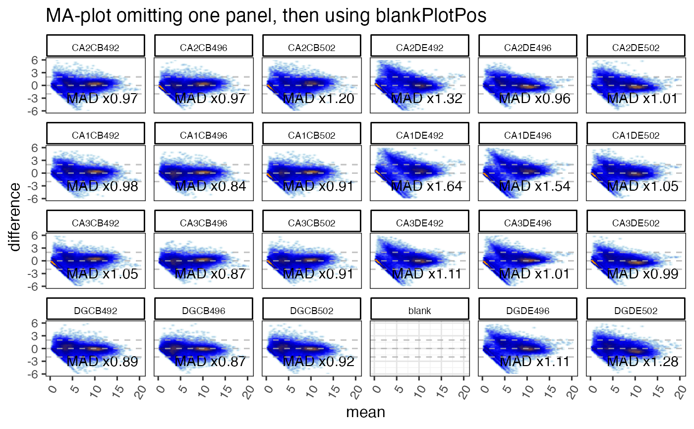
The argument blankPlotPos is intended to insert an empty panel
at a particular panel position, to help customize the alignment
of sample panels.
This option is typically used with ncol and nrow to define
a fixed layout of panel columns and rows. blankPlotPos refers
to panels numbered as drawn per row of panels,
Identifying potential sample outliers
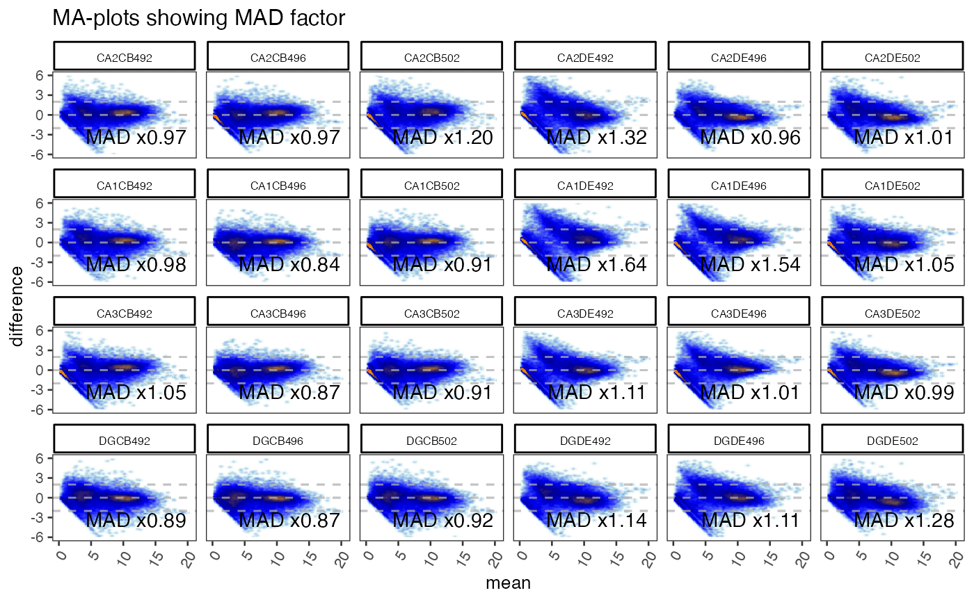
Use argument displayMAD=TRUE to display the per-sample MAD factor
relative to its centerGroups value, if provided. The MAD value
for each MA-plot panel is calculated using rows whose mean
is at or above outlierRowMin. The median MAD value is calculated
for each centerGroups grouping when groupedMAD=TRUE, by default.
Finally, each MA-plot panel MAD factor is the ratio of its MAD value
to the relevant median MAD value. MA-plot panels with MAD factor
above outlierMAD are considered outliers, and the color ramp
uses outlierColramp or outlierColor as a visual cue.
Putative outlier samples should usually not be determined when:
controlSamplesare defined to include only a subset of sample groups,centerGroupsis not defined, or represents more than one set of sample groups that are not intended to be statistically compared directly to one another.
Putative outlier samples may be defined when:
centerGroupsrepresents a set of sample groups that are intended to be involved in direct comparisonscenterGroupsrepresents each sample group
Potential sample outliers may be identified by setting a threshold
with outlierMAD, by default 5xMAD. For a sample to be considered
an outlier, its median difference from mean/median needs to be
five times higher than the median across samples.
We typically recommend an outlierMAD=2 when centering
by sample groups, or when centering within experiment subsets.
For one sample to have 2xMAD factor, its variance needs
to be uniquely twice as high as the majority of other samples, which
is typically symptomatic of possible technical failure.
There are exceptions to this suggested guideline, which includes scenarios where a batch effect may be involved.
To do:
Accept other object types as input, including Bioconductor classes:
ExpressionSet,SummarizedExperiment,MultiExperimentSetMake it efficient to convey group information, for example define
titleBoxColorwith group colors, allowcenterByGroup=TRUEwhich would re-use known sample group information.Adjust the suffix to indicate when
centerGroupsare being used. For example indicate'sampleID vs groupA'instead of'sampleID vs median'.
Functions
ggjammaplot():
See also
Other jam plot functions:
volcano_plot()
Other jam plot functions:
volcano_plot()
Examples
if (jamba::check_pkg_installed("SummarizedExperiment") &&
jamba::check_pkg_installed("farrisdata")) {
suppressPackageStartupMessages(require(SummarizedExperiment));
GeneSE <- farrisdata::farrisGeneSE;
titleBoxColor <- jamba::nameVector(
farrisdata::colorSub[as.character(colData(GeneSE)$groupName)],
colnames(GeneSE));
options("warn"=FALSE);
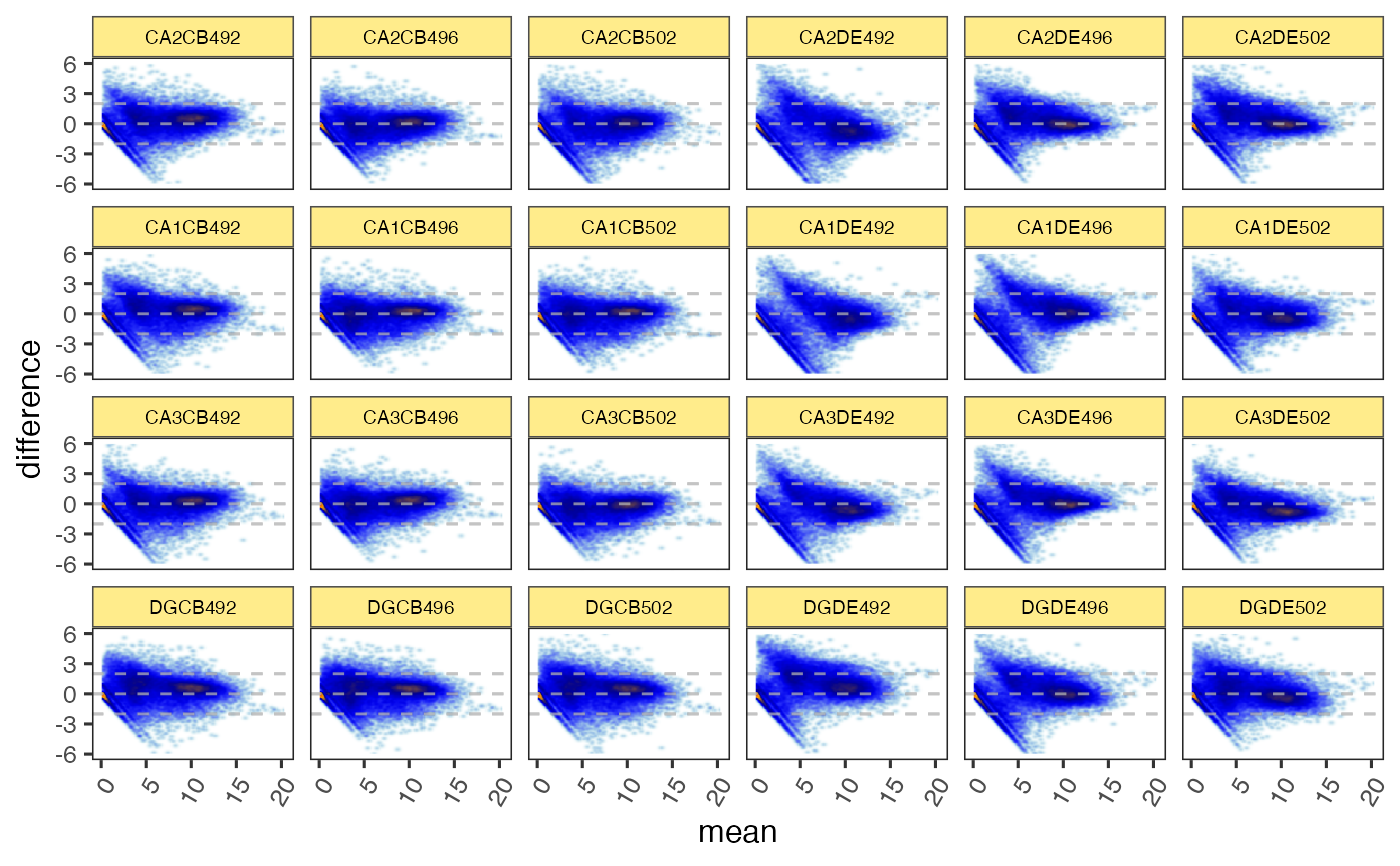
gg <- ggjammaplot(GeneSE,
ncol=6,
base_size=12,
assay_name="raw_counts")
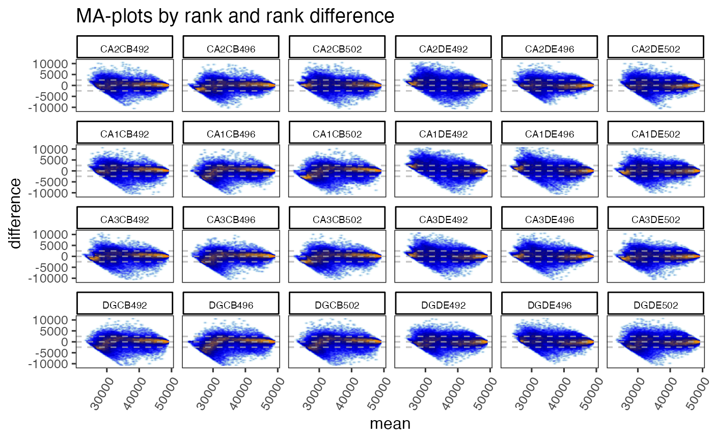
gg <- ggjammaplot(GeneSE,
ncol=6,
assay_name="counts",
useRank=TRUE,
ylim=c(-11000, 11000),
maintitle="MA-plots by rank and rank difference",
titleBoxColor=titleBoxColor)
gg <- ggjammaplot(GeneSE,
ncol=6,
assay_name="counts",
titleBoxColor=titleBoxColor,
base_size=10,
maintitle="MA-plots showing MAD factor",
displayMAD=TRUE)
gg <- ggjammaplot(GeneSE,
ncol=6,
assay_name="counts",
titleBoxColor=titleBoxColor,
maintitle="MA-plot omitting one panel, then using blankPlotPos",
whichSamples=colnames(GeneSE)[c(1:21, 23:24)],
blankPlotPos=22,
displayMAD=TRUE)
if (FALSE) {
ggdf <- ggjammaplot(GeneSE,
assay_name="counts",
whichSamples=c(1:3, 7:9),
return_type="data",
titleBoxColor=titleBoxColor)
highlightPoints1 <- names(jamba::tcount(subset(ggdf, mean > 15 & difference < -1)$item, 2))
highlightPoints2 <- subset(ggdf, name %in% "CA1CB492" &
difference < -4.5)$item;
highlightPoints <- list(
divergent=highlightPoints1,
low_CA1CB492=highlightPoints2);
ggdf_h <- ggjammaplot(GeneSE,
assay_name="counts",
highlightPoints=highlightPoints,
whichSamples=c(1:3, 7:9),
return_type="data",
titleBoxColor=titleBoxColor)
# you can use output from `jammaplot()` as input to `ggjammaplot()`:
jp2 <- jammaplot(GeneSE,
outlierMAD=2,
doPlot=FALSE,
assay_name="raw_counts",
filterFloor=1e-10,
filterFloorReplacement=NA,
centerGroups=colData(GeneSE)$Compartment,
subtitleBoxColor=farrisdata::colorSub[as.character(colData(GeneSE)$Compartment)],
useRank=FALSE);
gg1 <- ggjammaplot(jp2,
ncol=6,
titleBoxColor=titleBoxColor);
print(gg1);
}
}
#> Warning: Removed 534 rows containing non-finite values (`stat_density2d()`).
#> Warning: Removed 15648 rows containing missing values (`geom_raster()`).
 #> Warning: Removed 140 rows containing non-finite values (`stat_density2d()`).
#> Warning: Removed 15648 rows containing missing values (`geom_raster()`).
#> Warning: Removed 140 rows containing non-finite values (`stat_density2d()`).
#> Warning: Removed 15648 rows containing missing values (`geom_raster()`).
 #> Warning: Removed 322 rows containing non-finite values (`stat_density2d()`).
#> Warning: Removed 15648 rows containing missing values (`geom_raster()`).
#> Warning: Removed 322 rows containing non-finite values (`stat_density2d()`).
#> Warning: Removed 15648 rows containing missing values (`geom_raster()`).
 #> Warning: Removed 317 rows containing non-finite values (`stat_density2d()`).
#> Warning: Removed 15272 rows containing missing values (`geom_raster()`).
#> Warning: Removed 317 rows containing non-finite values (`stat_density2d()`).
#> Warning: Removed 15272 rows containing missing values (`geom_raster()`).
 # Note the example data requires the affydata Bioconductor package
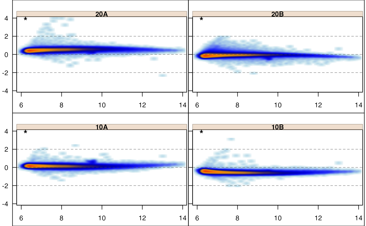
if (suppressPackageStartupMessages(require(affydata))) {
data(Dilution);
edata <- log2(1+exprs(Dilution));
jammaplot(edata);
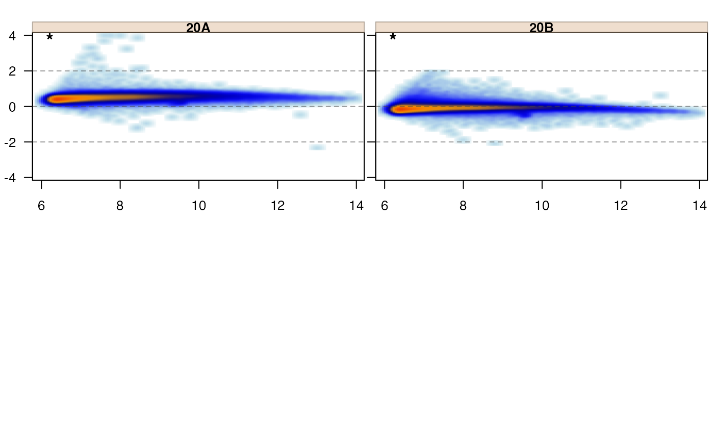
jammaplot(edata,
whichSamples=c(1, 2));
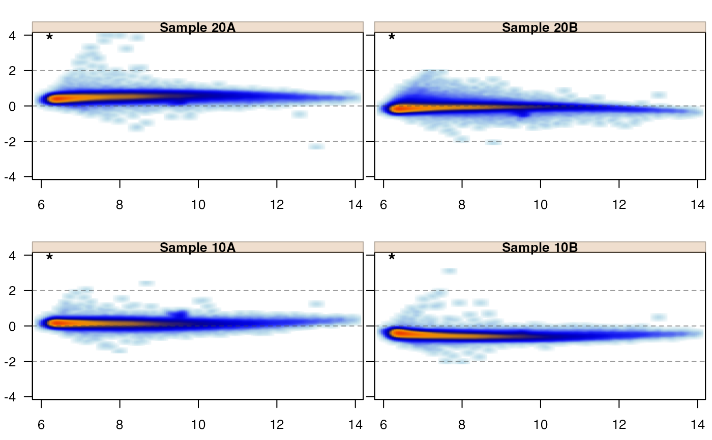
jammaplot(edata,
sample_labels=paste("Sample", colnames(edata)));
jammaplot(edata,
controlIndicator="titlestar");
jammaplot(edata,
controlIndicator="none");
jammaplot(edata,
panel_hook_function=function(i,...){box("figure")});
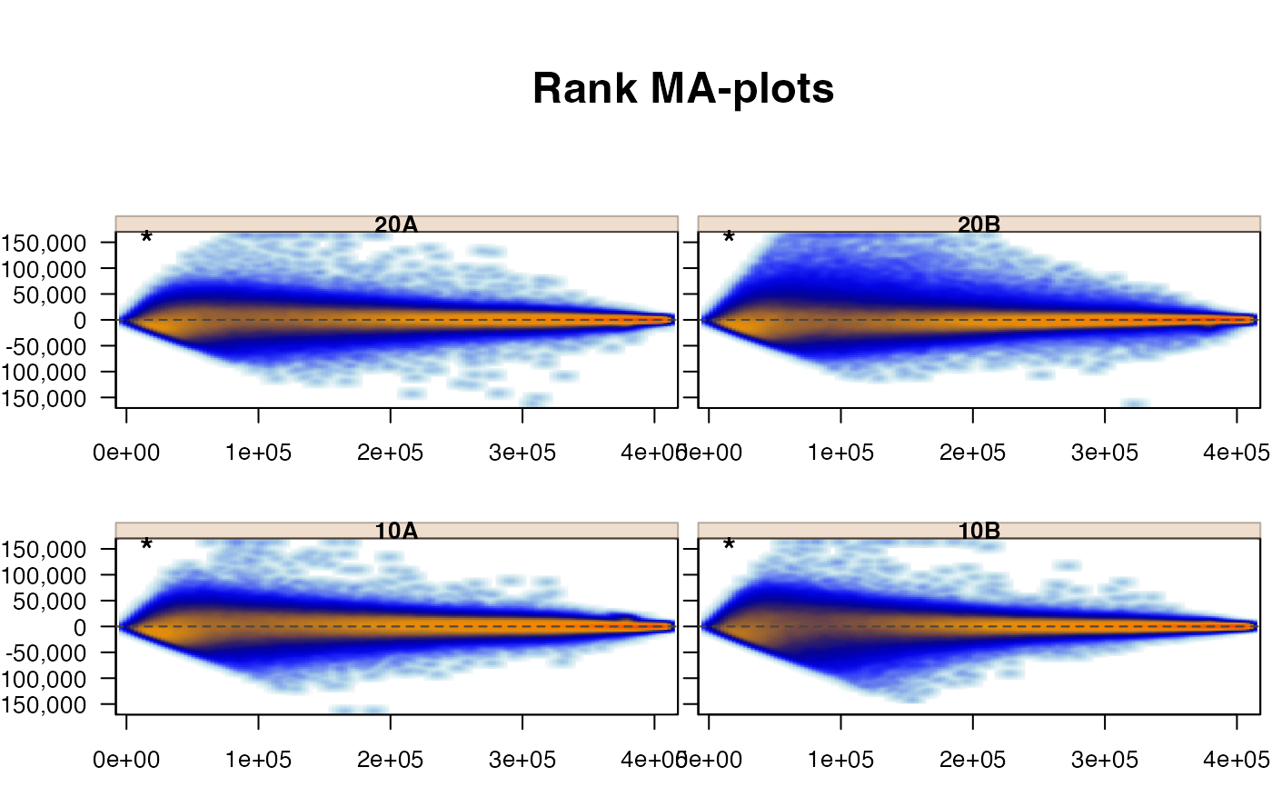
jammaplot(edata,
useRank=TRUE,
maintitle="Rank MA-plots");
}
# Note the example data requires the affydata Bioconductor package
if (suppressPackageStartupMessages(require(affydata))) {
data(Dilution);
edata <- log2(1+exprs(Dilution));
jammaplot(edata);
jammaplot(edata,
whichSamples=c(1, 2));
jammaplot(edata,
sample_labels=paste("Sample", colnames(edata)));
jammaplot(edata,
controlIndicator="titlestar");
jammaplot(edata,
controlIndicator="none");
jammaplot(edata,
panel_hook_function=function(i,...){box("figure")});
jammaplot(edata,
useRank=TRUE,
maintitle="Rank MA-plots");
}