Load R packages:
library(jamses)
suppressPackageStartupMessages(
library(SummarizedExperiment)
)
suppressPackageStartupMessages(
library(ComplexHeatmap)
)
Make the heatmap:
heatmap_se(se)The defaults are very good.
The custom options are great.
Why SummarizedExperiment?
SummarizedExperiment is an enhanced data
matrix
- It stores multiple data matrices.
Some examples:- Raw
- normalized
- batch-adjusted
- VST-normalized
- “counts” (or pseudocounts)
- “abundance” (or TPM, FPKM)
- Columns have annotations in
colData(). - Rows have annotations in
rowData(). - Annotations are used in
heatmap_se():- display annotations beside the heatmap
- split the heatmap by groups
- center the data in meaningful ways
- You can create a
SummarizedExperimentfrom any of:-
numericmatrix ExpressionSetDGEListDESeqDataset
-
See the SummarizedExperiment vignette for more detail.
Heatmap Principles
The heatmap_se() is opinionated.
- The default should be very close to ideal.
- There are many custom options.
We build upon ComplexHeatmap::Heatmap().
- It is amazing. And complex. We know this.
- You can combine heatmaps:
- Add them
+to display side-by-side. - Use
%v%to display top-to-bottom.
- Add them
Data are assumed to be log2-transformed.
- We recommend
log2(1 + x), ymmv. - log2-transformed values are consistent with many
’Omics tools which report log2 fold change.
Data are not scaled. (Gasp)
- We believe magnitude of change is important in Omics data.
It is helpful for critical review of the data,
which is the main purpose of a heatmap.
(A heatmap is not itself a decision-making tool,
however it very much helps assess the assumptions
and results obtained from other tools.) - Row-scaling adjusts the signal based upon the
variability on each row.
It is particularly effective when the range of
response is different for each row of data,
and where the range of response is more closely
associated with technical limitations than with
biological response.
In our experience, most ’Omics platforms are not dominated by this limitation. - Row-scaling has the nice benefit that it does not
require log2-transformed data.
It “naturally” transforms data into z-score units.
These units may or may not be biologically meaningful. - The z-score units are particularly useful when you
only want to show presence/absence, or high/low
relative to the range of signal on each row. - We aim to achieve many of the same goals without
scaling, because we find the actual magnitudes useful.
Data are row-centered.
- The average signal of each row is subtracted from
that row, resulting “difference from average”. - We assume log2-transformed data, therefore values are
called “log2 differences”. - These log2 differences are commonly shown in volcano plots,
and in MA-plots. - The “log2 differences” can be converted to fold changes,
so we use fold change to label the color key. - We recommend using the heatmap to display data as
similar as possible to the underlying statistical tests,
consistent with other supporting figures.
Always use a divergent color scale with centered data.
- (The same rule applies to z-scores, and correlations.)
- The color scale uses Brewer colors
'RdBu'in reverse:
blue-white-red
and white is always at zero. - Red is Up because this is a HEAT map.
- Blue is Down because it is cold.
- If Blue were
up, you should call it a COLD
map.
A cold map can be useful, but it is not a heat map.
The color scale uses a fixed range.
- Default range:
-8 to +8 fold. - It defines a consistent color-to-magnitude relationship.
Two-fold should look like a two-fold change. - This range represents biologically relevant changes for
most Omics data. (It can be adjusted.) - Extremely high values do not adjust the range,
otherwise it would compress the colors of everything else. - When the data have small changes, the heatmap will show
them as small changes. - The range may be adjusted when needed.
Data centering is flexible, and encouraged:
- By default, centering uses all samples.
“Global centering” - Centering can be “versus controls”.
- Centering can be within sub-groups,
'centerby groups'.
Examples of'centerby groups':- design factor(s),
- sample type,
- tissue type,
- cell line,
- processing batch,
- pairing factor,
- Each
'centerby group'can have its own controls. - For example, you may center within each cell line,
then center each sample to its respective control group.
Annotations are “easy”:
Statistical hits are “easy”:
- Provide
sestatsto add statistical hits to the left side. - Hits are colored by direction (Up/Down).
- The heatmap will subset to show only these hits.
Rows and columns can be grouped:
-
row_splitdefines row groups -
column_splitdefines column groups - use an
integernumber of groups, or annotationcolnames().
Heatmap Walkthrough
Each step in the walkthrough adds some detail. * Sometimes we
demonstrate other custom options as well,
just to give a flavor for the variety of styles available.
Basic Heatmap
Provide se (SummarizedExperiment data) and it will
create the default heatmap. * top_colnames are
auto-detected by default.
hm <- heatmap_se(se)
#> 'magick' package is suggested to install to give better rasterization.
#>
#> Set `ht_opt$message = FALSE` to turn off this message.

# draw by printing hm, or call draw() to add useful options
draw(hm)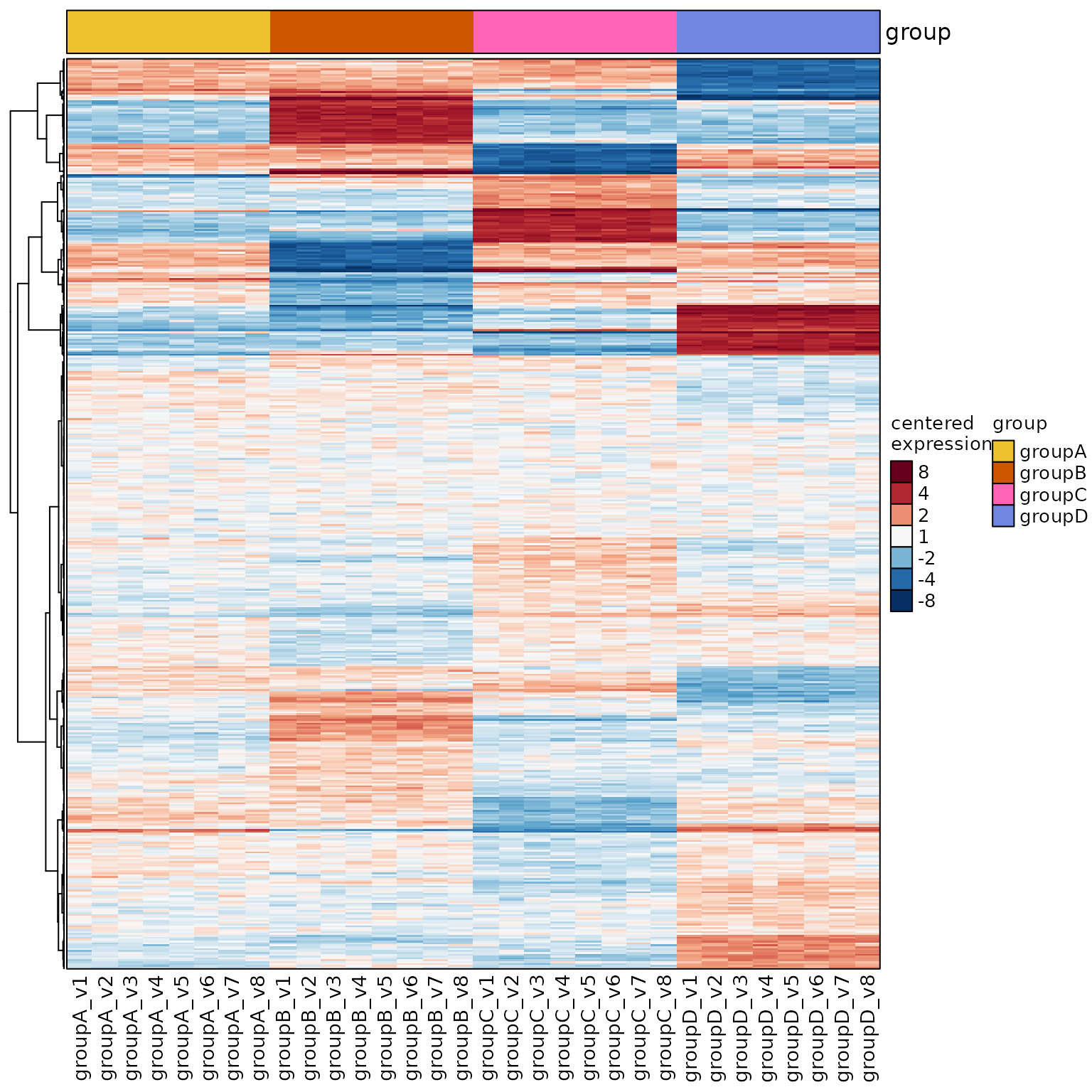
Custom Annotation Colors
- Use
sample_color_listto provide custom colors.- Provide a
listnamed by the annotation column.
- Or use
colorjam::group2colors()to define categorical colors.
- Provide a
-
rowData_colnamesadded row annotations to the left. -
left_annotation_name_rot=60rotated the annotation label.
sample_color_list <- list(
   group=c(
      groupA="gold",
      groupB="darkorange2",
      groupC="firebrick3",
      groupD="darkorchid4"
   ),
   Class=colorjam::group2colors(
      unique(rowData(se)$Class)))

heatmap_se(se,
   rowData_colnames="Class",
   left_annotation_name_rot=60,
   sample_color_list=sample_color_list)
#> 'magick' package is suggested to install to give better rasterization.
#>
#> Set `ht_opt$message = FALSE` to turn off this message.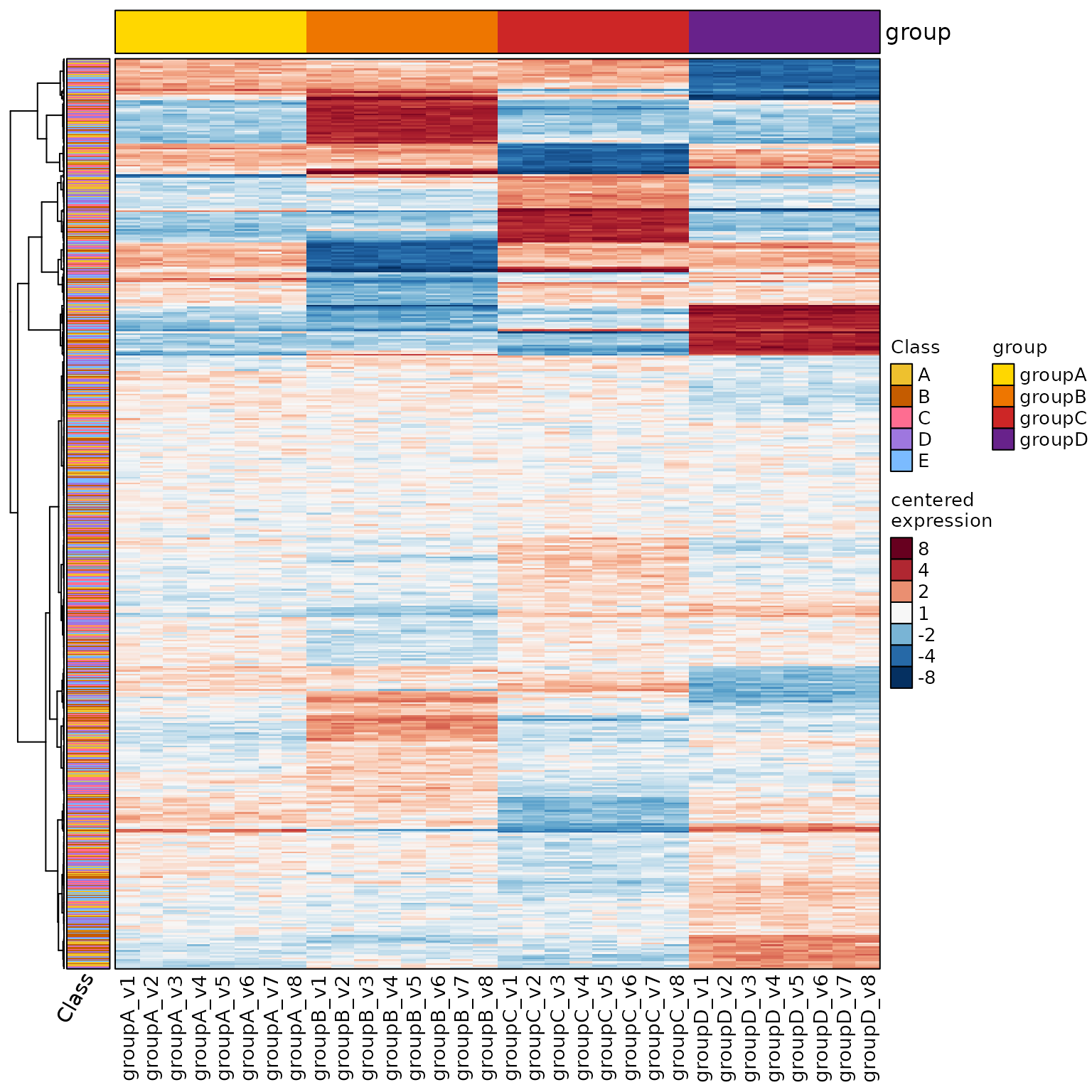
Heatmap Legend Options
-
ComplexHeatmap::ht_opt()allows some stylistic options
to be default whenever you draw a heatmap.
Some common options:-
merge_legends=TRUEmerges the color legends to one column. -
ROW_ANNO_PADDING,COLUMN_ANNO_PADDINGdefines a gap
between heatmap and row/column annotations, respectively.
-
- Also:
show_left_annotation_name="top"places the left
annotation label at the top instead of the bottom. - Also:
heatmap_se()will draw the heatmap by default,
useful when you don’t need to store the output.
(I usually end up needing the heatmap.)
ComplexHeatmap::ht_opt(merge_legends=TRUE)

heatmap_se(se,
   rowData_colnames="Class",
   show_left_annotation_name="top",
   left_annotation_name_rot=150,
   sample_color_list=sample_color_list)
#> 'magick' package is suggested to install to give better rasterization.
#>
#> Set `ht_opt$message = FALSE` to turn off this message.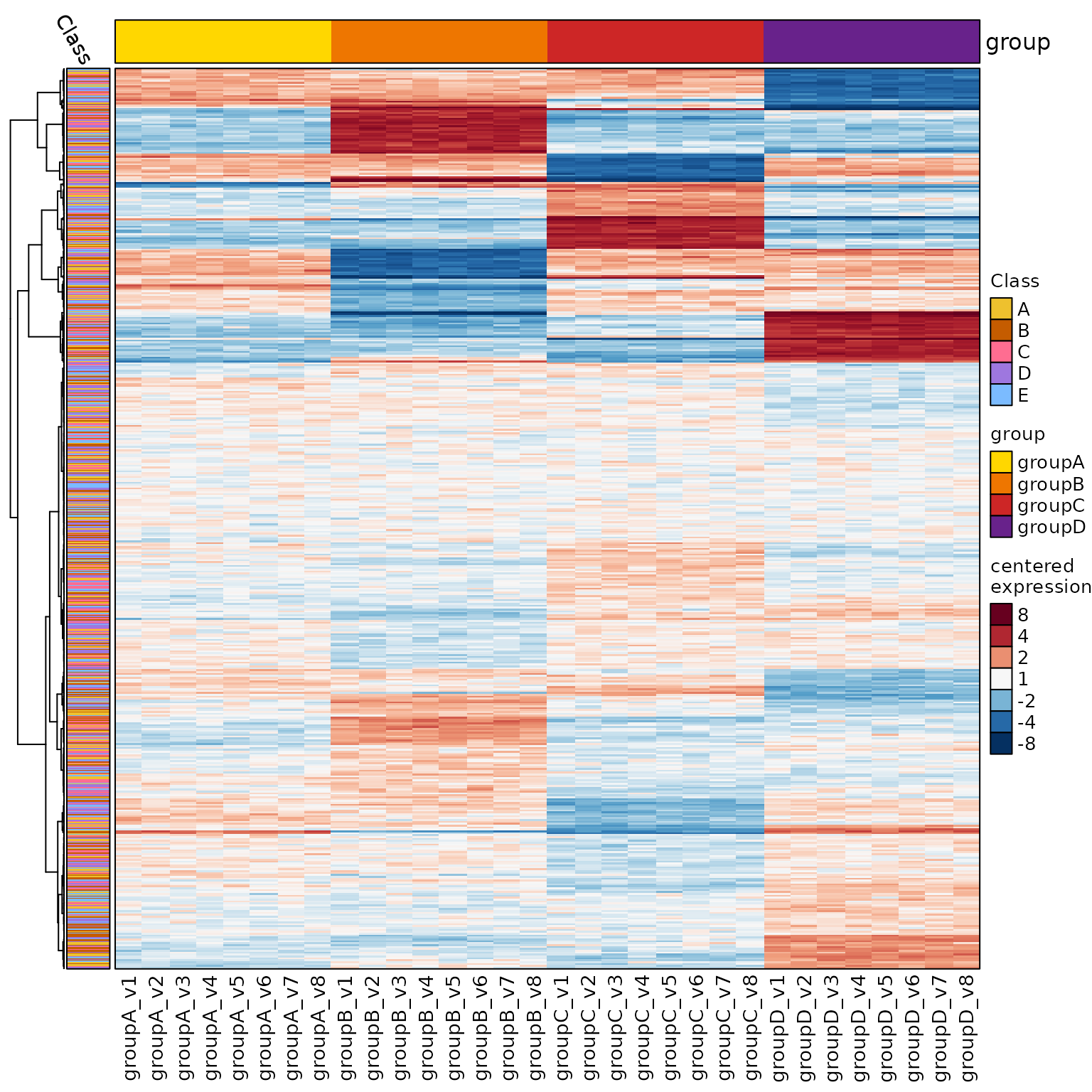
Row and Column Groups
Split Rows by Annotation
-
row_split="Class"will group rows by “Class”.
hm <- heatmap_se(se,
   rowData_colnames="Class",
   row_split="Class",
   sample_color_list=sample_color_list)
#> 'magick' package is suggested to install to give better rasterization.
#>
#> Set `ht_opt$message = FALSE` to turn off this message.

draw(hm)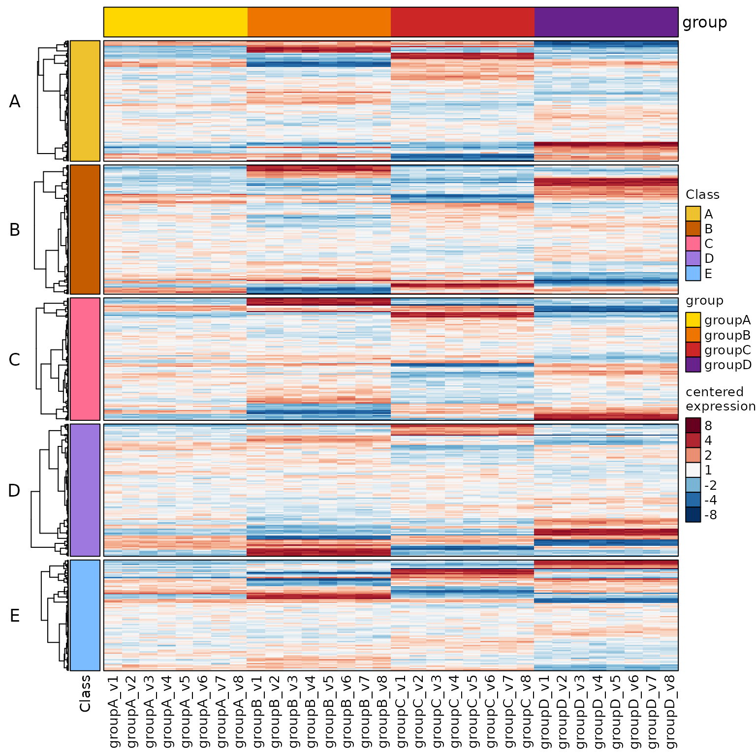
Split Rows and Columns
-
column_split="group"splits the columns. -
row_split="Class"splits the rows. - You can provide multiple columns if needed.
hm <- heatmap_se(se,
   column_split="group",
   row_split="Class",
   rowData_colnames="Class",
   sample_color_list=sample_color_list)
#> 'magick' package is suggested to install to give better rasterization.
#>
#> Set `ht_opt$message = FALSE` to turn off this message.

hm2 <- draw(hm)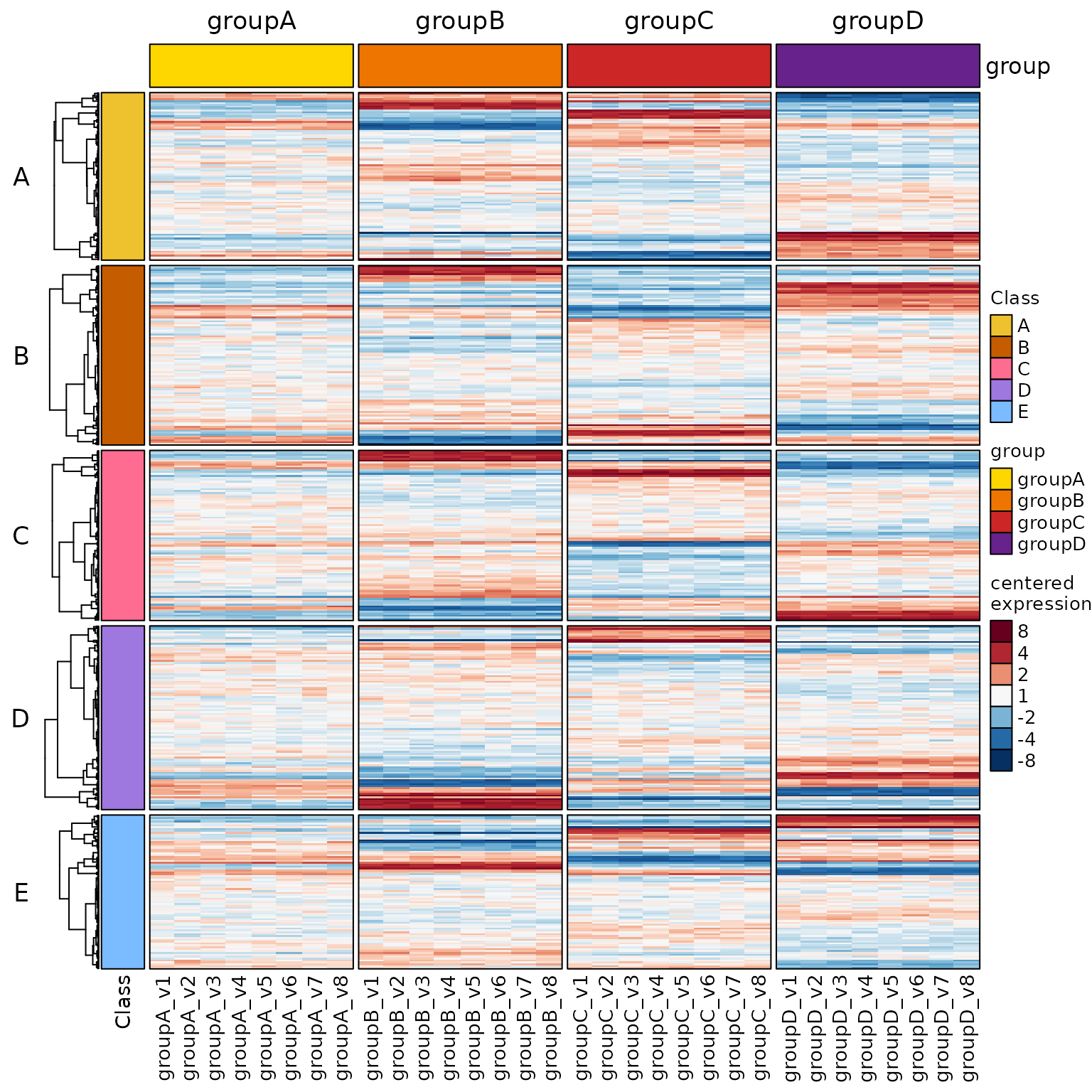
Get the Row Group Order
- Now seems like a good time to get the row order:
jamba::heatmap_row_order(hm)- It returns a
listseparated by row group.
- It works best with the
hm2drawn heatmap, since
some clustering methods use a random element.
hro <- jamba::heatmap_row_order(hm2);
lengths(hro)
#>   A   B   C   D   E
#> 196 210 199 215 180
See the first five entries per row group:
lapply(hro, head, 5)
#> $A
#>   row_0640   row_0405   row_0417   row_0730   row_0847
#> "row_0640" "row_0405" "row_0417" "row_0730" "row_0847"
#>
#> $B
#>   row_0087   row_0075   row_0421   row_0624   row_0238
#> "row_0087" "row_0075" "row_0421" "row_0624" "row_0238"
#>
#> $C
#>   row_0834   row_0593   row_0670   row_0823   row_0066
#> "row_0834" "row_0593" "row_0670" "row_0823" "row_0066"
#>
#> $D
#>   row_0349   row_0755   row_0633   row_0784   row_0208
#> "row_0349" "row_0755" "row_0633" "row_0784" "row_0208"
#>
#> $E
#>   row_0948   row_0115   row_0874   row_0165   row_0227
#> "row_0948" "row_0115" "row_0874" "row_0165" "row_0227"
Add Grouped Column Labels
The example illustrates a two-factor design: 1. Genotype: wildtype (WT) and knockout (KO) 2. Treatment: Control and Dexamethasone (Dex)
Column split:
column_split=c("Genotype", "Treatment")controlSamplesuses “WT” and “Control”-
Several features are enabled:
-
apply_hm_column_title=TRUEdisplays the heatmap title. -
top_colnames=FALSEhides the top annotation. -
heatmap_column_group_labels()adds grouped labels. -
hm_title_bufferadds whitespace for the grouped lines.
-
We add two design factors:
Genotype,Treatment
colData(se)$Genotype <- rep(
   factor(c("WT", "KO"), levels=c("WT", "KO")),
   each=16);
colData(se)$Treatment <- rep(
   c("Control", "Dex"),
   each=8);

# center by groupA samples
use_controlSamples <- rownames(
   subset(colData(se),
      Genotype %in% "WT" &
      Treatment %in% "Control"))

hm9 <- heatmap_se(se,
   apply_hm_column_title=TRUE,
   hm_title_buffer=4,
   controlSamples=use_controlSamples,
   control_label="vs WT_Control",
   sestats=sestats,
   top_colnames=c("Genotype", "Treatment"),
   column_split=c("Genotype", "Treatment"),
   row_split=6,
   column_gap=grid::unit(c(1, 2, 1), "mm"),
   sample_color_list=sample_color_list)
hm9_drawn <- ComplexHeatmap::draw(hm9)

# now add fancy labels
heatmap_column_group_labels(
   hm_group_list=c("Treatment", "Genotype"),
   font_cex=1.3,
   se=se,
   hm_drawn=hm9_drawn)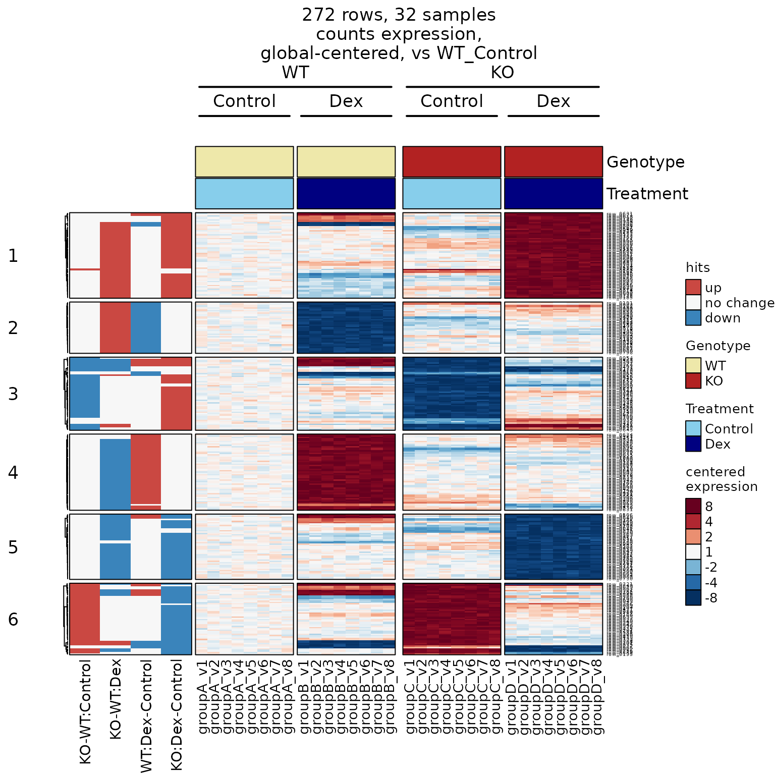
- Use
y_offset_linesto adjust the y position of labels.
Change Column Group Order
The example below shows the same heatmap
grouped by: 1. Treatment 2. Genotype
hm10 <- heatmap_se(se,
   apply_hm_column_title=TRUE,
   hm_title_buffer=4,
   controlSamples=use_controlSamples,
   control_label="vs WT_Control",
   sestats=sestats,
   top_colnames=c("Treatment", "Genotype"),
   column_split=c("Treatment", "Genotype"),
   row_split=6,
   sample_color_list=sample_color_list)
hm10_drawn <- ComplexHeatmap::draw(hm10,
   merge_legends=TRUE)

# now add fancy labels
heatmap_column_group_labels(
   hm_group_list=c("Genotype", "Treatment"),
   font_cex=1.2,
   se=se,
   hm_drawn=hm10_drawn)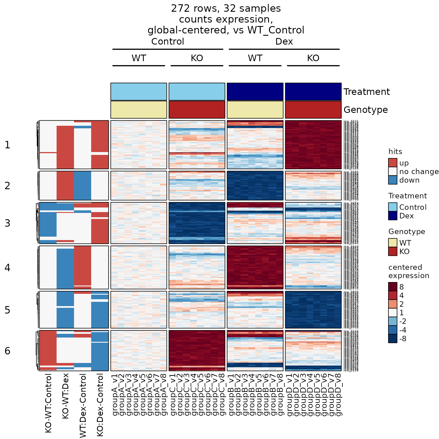
Data Centering
- Default “data centering” subtracts the row mean value,
resulting in “difference from global mean”.
We refer to this approach as “global centering”. - Centering typically uses the mean value (the average),
however it can use median withuseMedian=TRUE.
The median is effective in reducing the visual effects
of outlier points. - “Versus control”: Centering can be focused on
a
control group, instead of global centering. This approach
is very effective at visualizing the data as it is seen
by statistical contrasts. In fact, it is encouraged. - “Within Groups”: Data can be centered within
sub-groups, called ‘center-by groups’. This approach
is quite useful and versatile.- Consider an experiment with two different cell lines,
comparing treatment versus control.
The cell lines have substantial differences from each other,
however the treatment effects may be similar.
We would “center-by Cell Line”, then “versus Control”. - Consider an experiment with cells derived from clinical
patients, each patient sample is treated multiple ways.
Again, “center-by Patient”, then either “global center” or
“versus Control”.
- Consider an experiment with two different cell lines,
Working examples are shown below.
Center Using a Control Group
-
controlSamplesdefines a subset of samples
to be the reference for data centering.- Here we use samples in
"groupA". -
control_label="vs GroupA"describes the control
- Here we use samples in
-
column_title_rot=90also rotates the column group
title 90 degrees. - We define a new attribute
'hm_title'as a
convenient heatmap title.-
column_titleadds the title when wedraw()
the heatmap.
-
# center by groupA samples
use_controlSamples <- rownames(
      subset(colData(se), group %in% "groupA"))

# - control_label
hm3 <- heatmap_se(se,
   controlSamples=use_controlSamples,
   control_label="vs groupA",
   column_split="group",
   column_title_rot=90,
   row_split="Class",
   rowData_colnames="Class",
   cluster_row_slices=FALSE,
   sample_color_list=sample_color_list)

hm4 <- ComplexHeatmap::draw(hm3,
   column_title=attr(hm3, "hm_title"))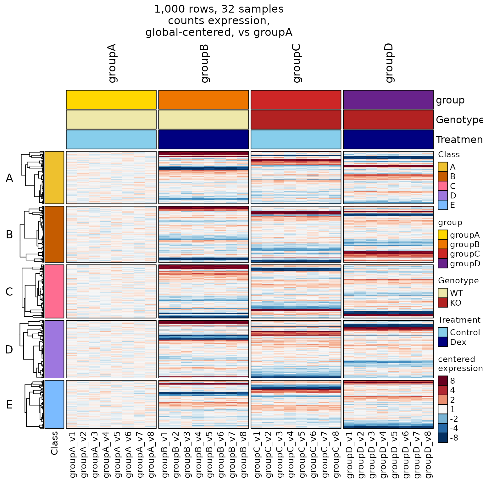
Center By Genotype
-
centerby_colnames="Genotype"centers within WT or KO -
use_controlSamples_Treatuses ‘Control’ samples
in both WT and KO.- It shows “Dex - Control” in each Genotype.
-
column_gapadds a custom gap between column groups.
use_controlSamples_Treat <- rownames(
      subset(colData(se), Treatment %in% "Control"))

hm11 <- heatmap_se(se,
   apply_hm_column_title=TRUE,
   hm_title_buffer=3,
   controlSamples=use_controlSamples_Treat,
   control_label="vs Control",
   sestats=sestats,
   top_colnames=FALSE,
   centerby_colnames="Genotype",
   column_split=c("Genotype", "Treatment"),
   row_split=6,
   column_gap=grid::unit(c(2, 4, 2), "mm"),
   sample_color_list=sample_color_list)
hm11_drawn <- ComplexHeatmap::draw(hm11,
   merge_legends=TRUE)

# now add fancy labels
heatmap_column_group_labels(
   hm_group_list=c("Treatment", "Genotype"),
   font_cex=1.2,
   se=se,
   hm_drawn=hm11_drawn)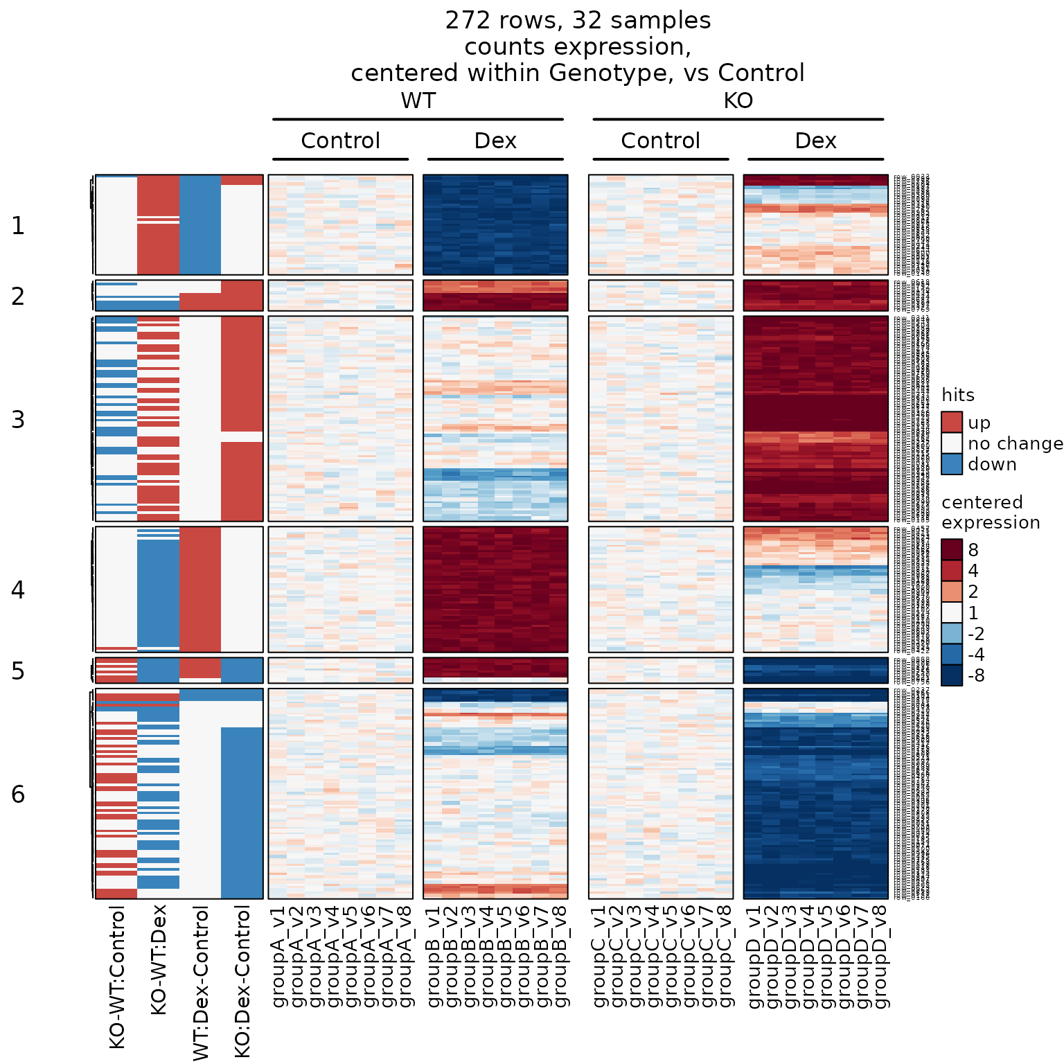
Center by Batch
-
simulate_se_test()- Simulates test data that contains a blocking effect.
It also represents pairing factors (repeated measures), or batch effect. - When simulating four groups (default),
it simulates two-factor additive changes.
- Simulates test data that contains a blocking effect.
-
centerby_colnames="batch"> Important Note: This technique is entirely visual,
although it helps confirm potential structure within the data.
The math very closely mimics the adjustment performed in most
statistical tools, however we recommend using the proper
statistical adjustments, specificallyblockin limma, or
using an additional factor in DESeq2 or edgeR. It is generally
not recommended to perform statistical testing with
batch-adjusted data.
Without Batch-Centering
seb <- simulate_se_test(ngroups=4, nreps=8, multiplier=2)
#> Warning in rep(c("Ctl", "Dex"), each = nreps * 2): first element used of 'each'
#> argument
#> Warning in rep(c("WT", "KO"), each = nreps): first element used of 'each'
#> argument
#> Warning in matrix(ncol = ngroups, nrow = nrow(m), data = c(rep(0, nrow(m)), :
#> data length [1249] is not a sub-multiple or multiple of the number of rows
#> [250]
#> Warning in seq_len(nreps): first element used of 'length.out' argument
#> Warning in seq_len(nreps): first element used of 'length.out' argument
#> Warning in seq_len(nreps): first element used of 'length.out' argument
#> Warning in seq_len(nreps): first element used of 'length.out' argument
colData(seb)[, 2:3] <- colData(se)[, 3:4]
colnames(colData(seb))[2:3] <- colnames(colData(se))[3:4]

hm11 <- heatmap_se(
   seb,
   column_title="Global Centering",
   top_colnames=c("Genotype", "Treatment", "batch"),
   column_split=c("Genotype", "Treatment"),
   row_split=6,
   column_gap=grid::unit(c(2, 4, 2), "mm"),
   sample_color_list=sample_color_list)
hm11_drawn <- ComplexHeatmap::draw(hm11)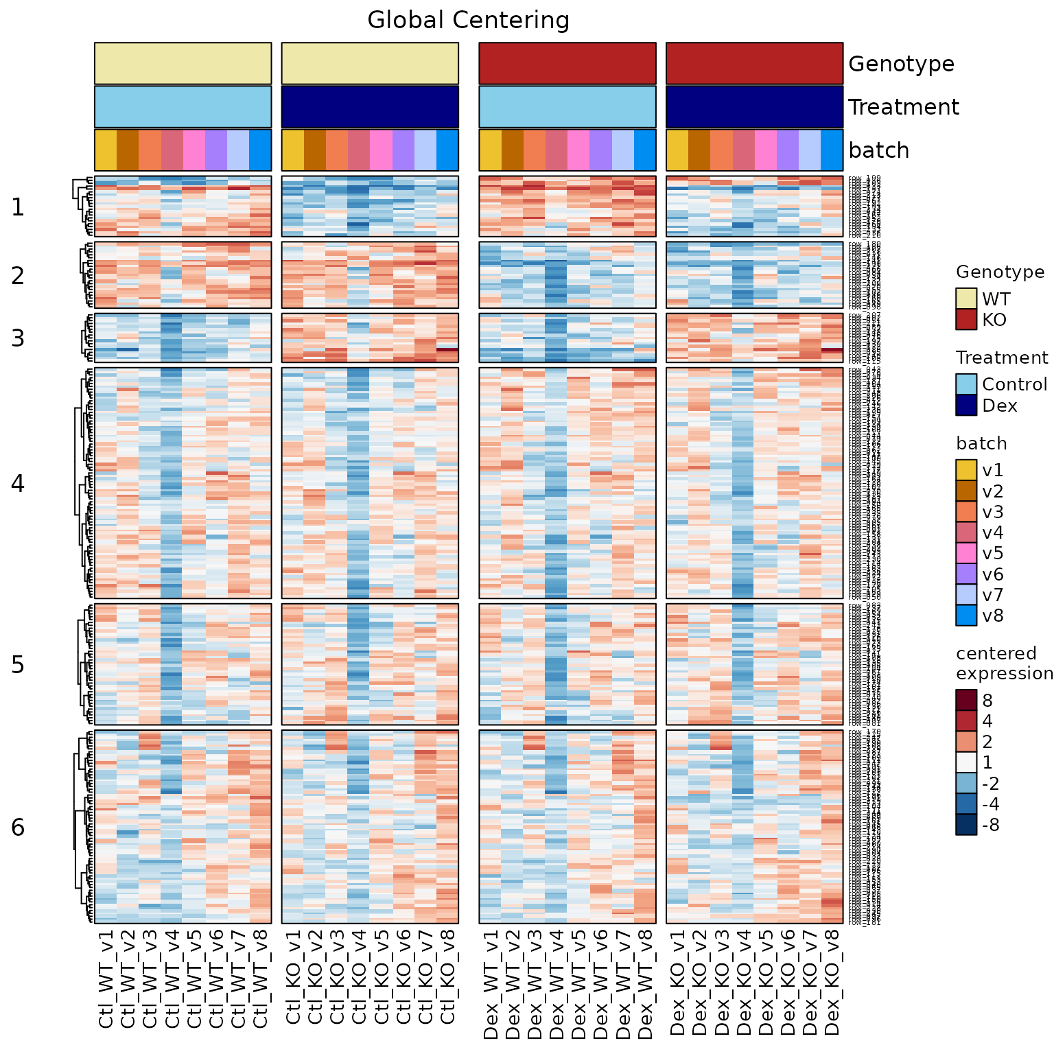
Center within batch
hm12 <- heatmap_se(
   seb,
   column_title="Within-Batch Centering",
   top_colnames=c("Genotype", "Treatment", "batch"),
   column_split=c("Genotype", "Treatment"),
   centerby_colnames="batch",
   row_split=6,
   column_gap=grid::unit(c(2, 4, 2), "mm"),
   sample_color_list=sample_color_list)
hm12_drawn <- ComplexHeatmap::draw(hm12)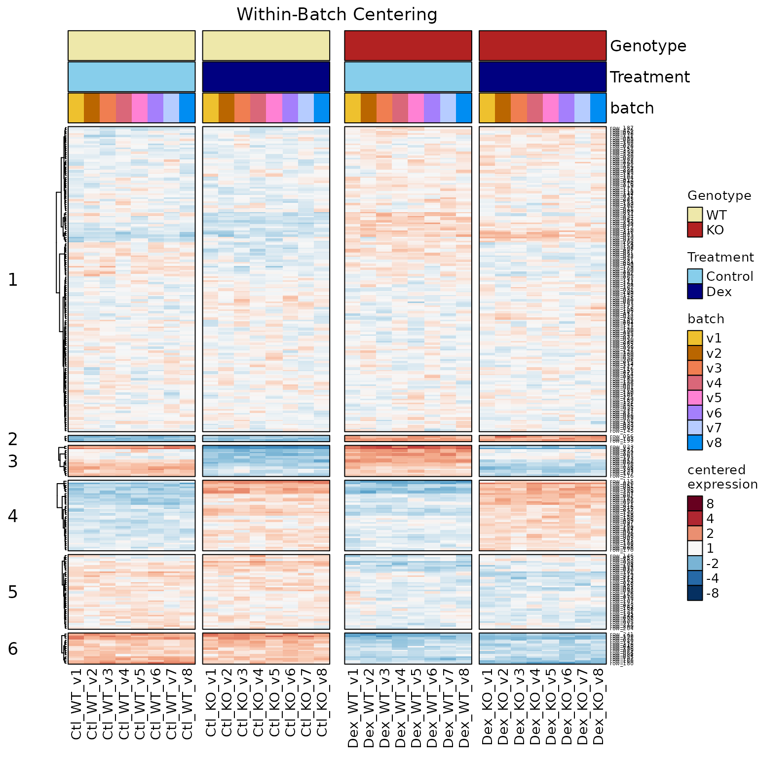
Compare Two Heatmaps
-
ComplexHeatmap::Heatmapobjects can be+added
together to display both heatmaps side-by-side. - **It requires both heatmaps to have identical rows.
- It does not require the heatmaps to have identical clustering, row split.
-
ht_gapusesgrid::unit()to define a 3-cm
gap between heatmaps.
ComplexHeatmap::draw(
   hm11 + hm12,
   column_title="Comparing Two Data Centering Approaches",
   column_title_gp=grid::gpar(fontsize=20),
   ht_gap=grid::unit(3, "cm")
)
#> Warning: Heatmap/annotation names are duplicated: centered expression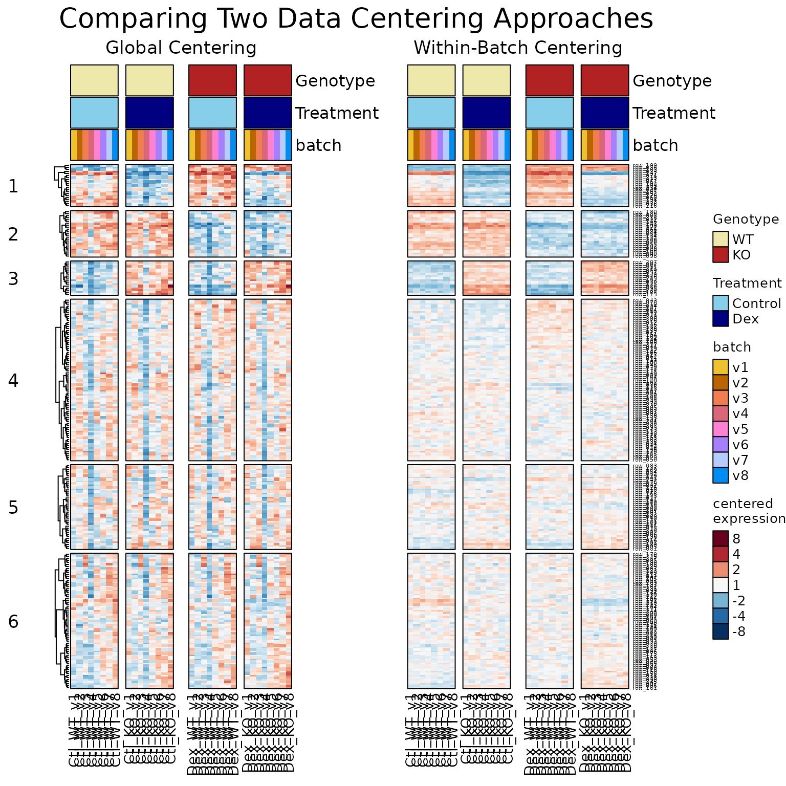
Statistical Hits
Display Statistical Hits
-
sestatsenables statistical hits on the left side. - It can be a
listnamed by contrast, each with:- a
numericvector named bygenerownames. - values should be
-1down, or+1up. - Any non-zero value is considered a ‘hit’.
- a
- It can be an incidence matrix.
-
rownamesshould match some heatmaprownames. -
colnamesshould be contrast names - values are
numeric, where-1is down,+1is up.
-
- It can be
SEStatsfromse_contrast_stats().- This step is outside the scope, but is convenient!
- See Run Limma Statistics for an example.
We create a list of hit vectors:
# define a random set of hits
sestats_list <- list(
   contrast1=setNames(
      sample(c(1, -1), replace=TRUE, size=50),
      sample(rownames(se), size=50)
   ),
   contrast2=setNames(
      sample(c(1, -1), replace=TRUE, size=50),
      sample(rownames(se), size=50)
   )
)- Now create the heatmap with
sestats:
hm6 <- heatmap_se(se,
   controlSamples=use_controlSamples,
   control_label="vs groupA",
   sestats=sestats_list,
   column_split="group",
   row_split="Class",
   rowData_colnames="Class",
   sample_color_list=sample_color_list)

ComplexHeatmap::draw(hm6,
   column_title=attr(hm6, "hm_title"))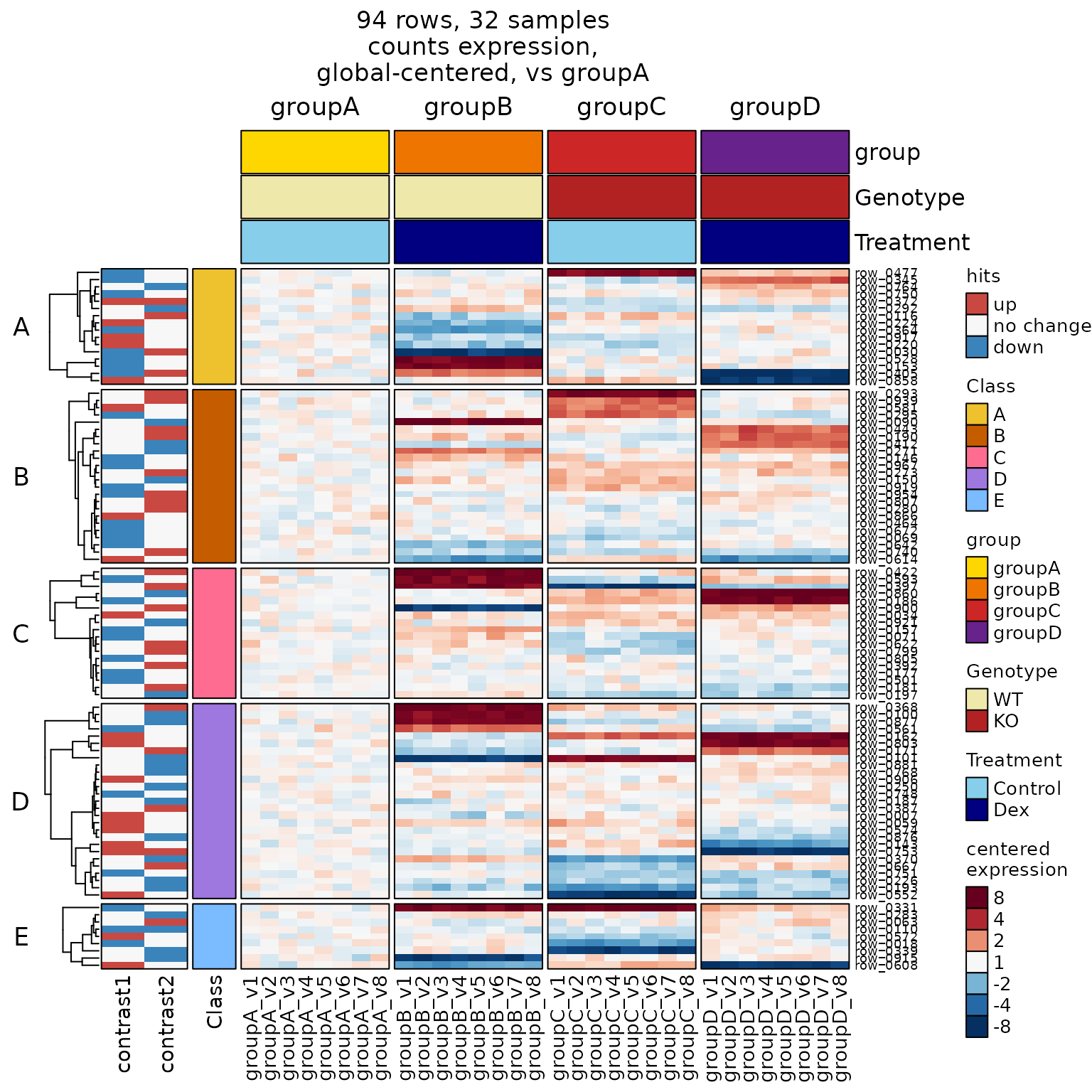
Run Limma Statistics
-
se_contrast_stats()automateslimmafor multiple contrasts.- It applies
lmFit(),fitContrasts(),topTable(),
evenvoom()orDEqMSas appropriate. - It analyzes each contrast and assay.
- It returns
SEStats, used directly in the heatmap
- It applies
# SEDesign
sedesign <- groups_to_sedesign(
   colData(se)[, "group", drop=FALSE])
# use only "versus groupA"
contrast_names(sedesign) <- jamba::vigrep("-groupA", contrast_names(sedesign))

# run stats
sestats <- se_contrast_stats(
   se=se,
   fold_cutoff=4,
   sedesign=sedesign,
assay_name="counts")- Use
SEStatswithheatmap_se():
hm6s <- heatmap_se(se,
   controlSamples=use_controlSamples,
   control_label="vs groupA",
   sestats=sestats,
   column_split="group",
   row_split=6,
   rowData_colnames="Class",
   sample_color_list=sample_color_list)

ComplexHeatmap::draw(hm6s,
   column_title=attr(hm6s, "hm_title"))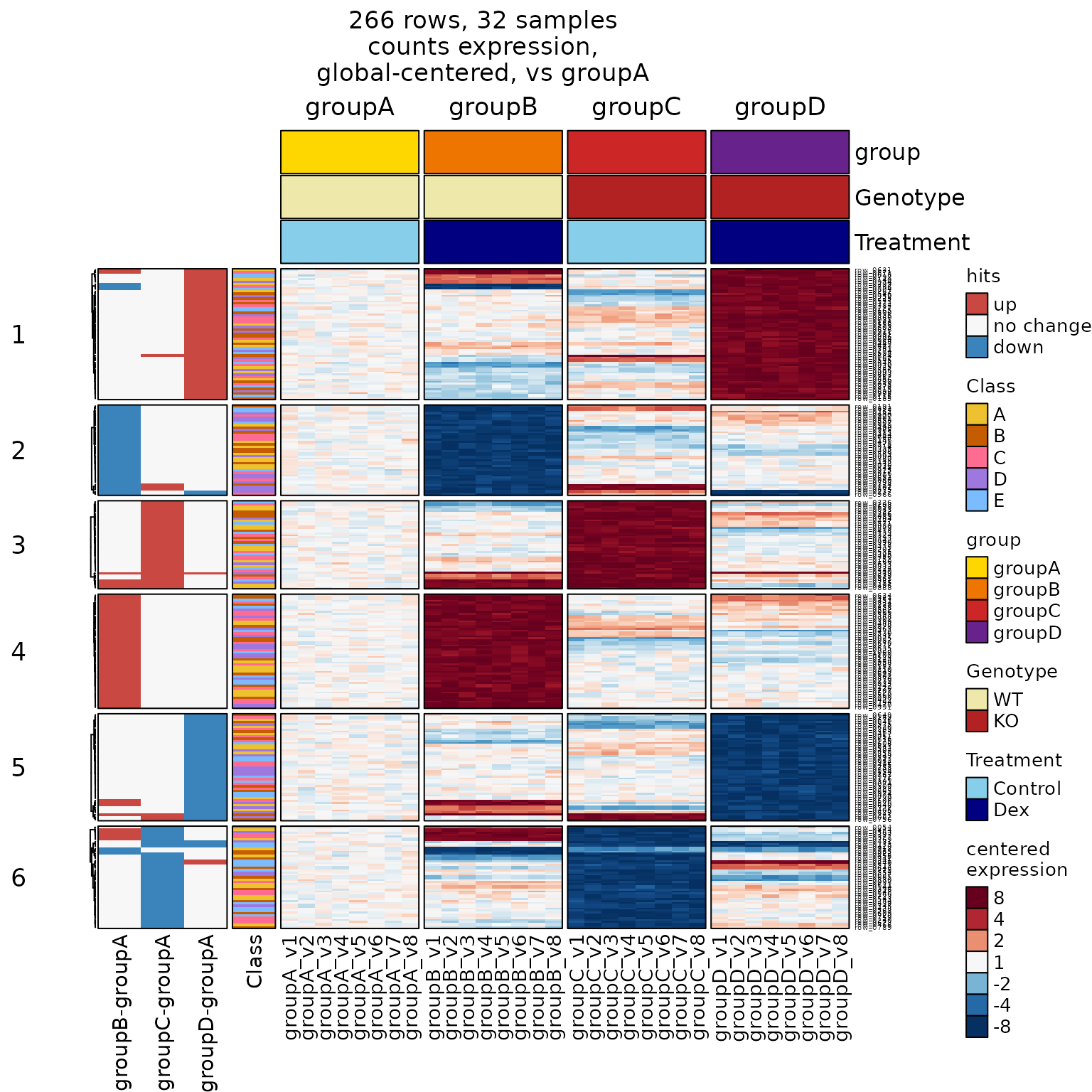
Drill Down by Row Cluster
-
row_subcluster="4"makes it easy to answer
“What is going on with Cluster 4?”
# for fun, "drill down" into cluster 5
hm6s_4 <- heatmap_se(se,
   controlSamples=use_controlSamples,
   control_label="vs groupA",
   sestats=sestats,
   column_split="group",
   row_split=6,
   row_subcluster=4,
   rowData_colnames="Class",
   sample_color_list=sample_color_list)
#> Warning: The heatmap has not been initialized. You might have different results
#> if you repeatedly execute this function, e.g. when row_km/column_km was
#> set. It is more suggested to do as `ht = draw(ht); row_order(ht)`.

ComplexHeatmap::draw(hm6s_4,
   column_title=attr(hm6s_4, "hm_title"))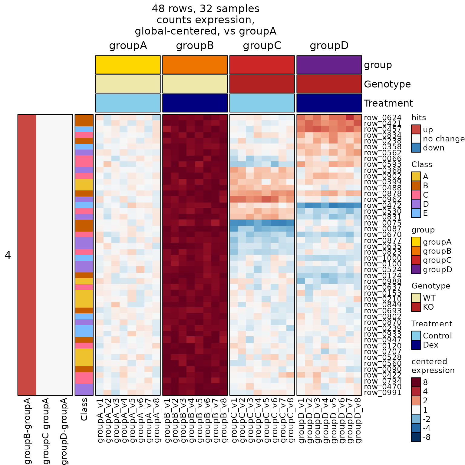
Use a Hit Incidence Matrix
- What is an incidence matrix, you wonder?
- We demonstrate the data format below.
- Rows are genes from
rownames(se). - Columns are contrasts, comparisons, or any useful label.
- Any non-zero value is considered a hit,
and it colorized by direction.
# convert sestats to list, then incidence matrix
sestats_hitlist <- hit_array_to_list(sestats)
sestats_hitim <- venndir::list2im_value(sestats_hitlist[1:2])
print(head(sestats_hitim));
#>          groupB-groupA groupC-groupA
#> row_0022            -1            -1
#> row_0030            -1             0
#> row_0066             1             0
#> row_0075             1             0
#> row_0080            -1             0
#> row_0087 1 0- Now
sestats_hitimdefines statistical hits.
hm7 <- heatmap_se(se,
   controlSamples=use_controlSamples,
   control_label="vs groupA",
   sestats=sestats_hitim,
   column_split="group",
   rowData_colnames="Class",
   sample_color_list=sample_color_list)

ComplexHeatmap::draw(hm7,
   column_title=attr(hm7, "hm_title"))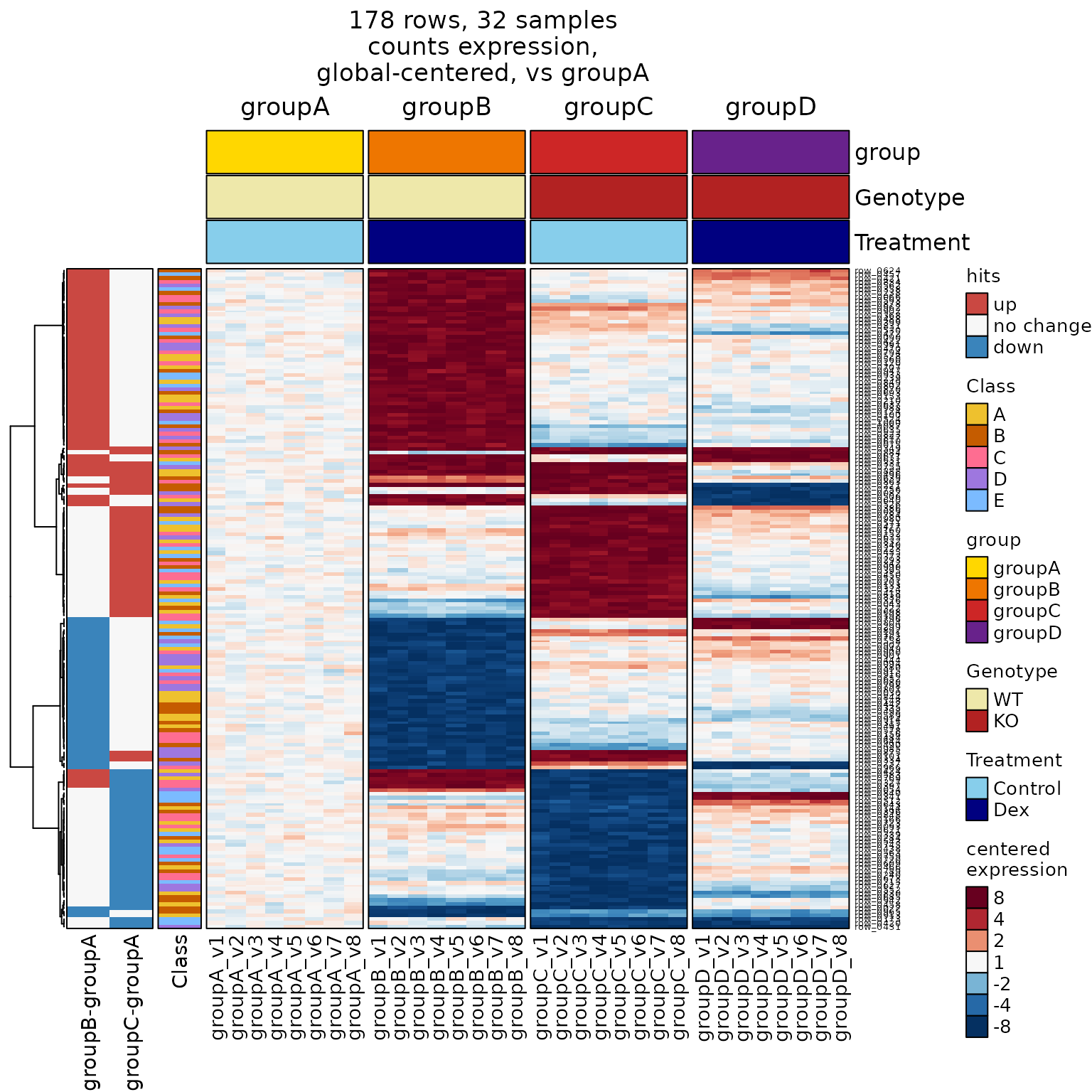
Correlation Heatmaps
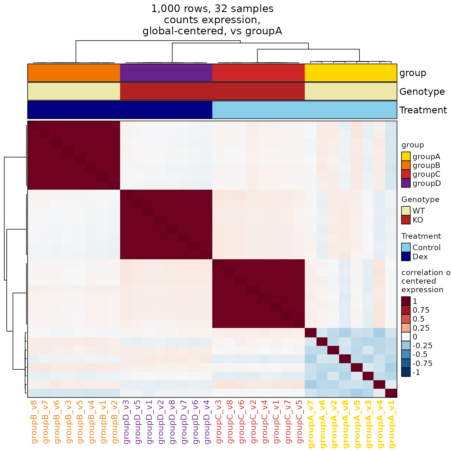
Any standard heatmap_se() can be converted to a
correlation heatmap by adding:correlation=TRUE
- It uses the centered data that would have been displayed
in the heatmap, and instead callscor()to create Pearson
correlationmatrix.- You can review the data used for correlation using:
hm <- heatmap_se(se)
then:hm@matrix - Correlation uses
use="pairwise.complete.obs"and...
ellipses can be used for custommethod.
- You can review the data used for correlation using:
- The heatmap defaults are changed:
-
max_color=1so the color range becomes-1 to +1 -
row_splitandrow_label_colnamerefer tocolData(se). -
legend_labelsuselegend_atdirectly, no fold conversion. -
cluster_columnscontrols rows and columns, for symmetry. - The default legend title adds
'correlation of'.
-
hm8corr <- heatmap_se(seb,
   correlation=TRUE,
   apply_hm_column_title=TRUE,
   # controlSamples=use_controlSamples,
   cluster_columns=FALSE,
   sample_color_list=sample_color_list)

ComplexHeatmap::draw(hm8corr)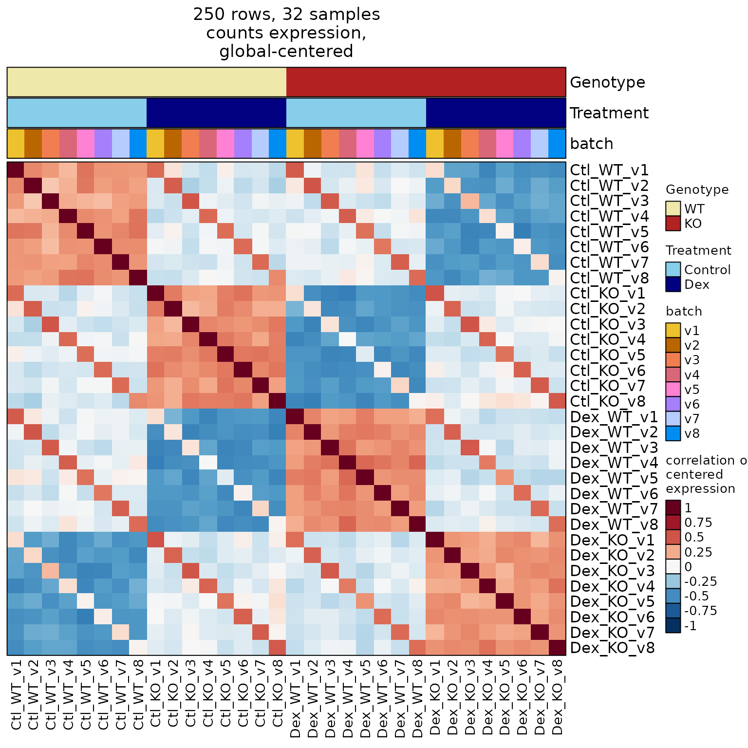
Hint: This correlation heatmap shows what we expect
when there is a sample pairing or batch effect.
The key feature is “positive correlation along a diagonal.”
- You can adjust for pairing factor using
centerby_colnames="batch":
hm8corr_batch <- heatmap_se(seb,
   correlation=TRUE,
   centerby_colnames="batch",
   apply_hm_column_title=TRUE,
   cluster_columns=FALSE,
   sample_color_list=sample_color_list)

ComplexHeatmap::draw(hm8corr_batch)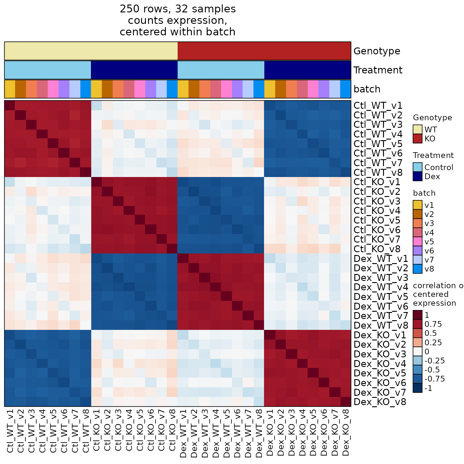
Incidentally, the very small negative correlation along
the diagonal is also indicative of simple batch adjustment.
The common signal is removed across replicates in the same
batch, which by definition leaves only slight differences.
As a result, the residual is typically slightly negative.
Notice also that the overall group correlations have
increased substantially, due to the reduction in non-group
correlated signal. This increase is another indication that
the batch/pairing effect was appropriately modeled.
Custom Visual Options
Add Callout Labels for Some Rows
-
mark_rowsadds labels to the right- Great for labeling genes of interest, especially
when there are too many rows in the heatmap. - We add 5 labels from ‘A’, and 3 labels from ‘D’.
- Great for labeling genes of interest, especially
- In RStudio, you may want to silence some warnings:
ComplexHeatmap::ht_opt(message=FALSE)
# add "callout" labels for a subset of rows
hro <- jamba::heatmap_row_order(hm4);
mark_rows <- c(
   sample(hro[["A"]], size=5),
   sample(hro[["D"]], size=3));

hm5 <- heatmap_se(se,
   mark_rows=mark_rows,
   controlSamples=use_controlSamples,
   control_label="vs groupA",
   column_split="group",
   column_title_rot=90,
   row_split="Class",
   rowData_colnames="Class",
   sample_color_list=sample_color_list)

ComplexHeatmap::draw(hm5,
   column_title=attr(hm5, "hm_title"))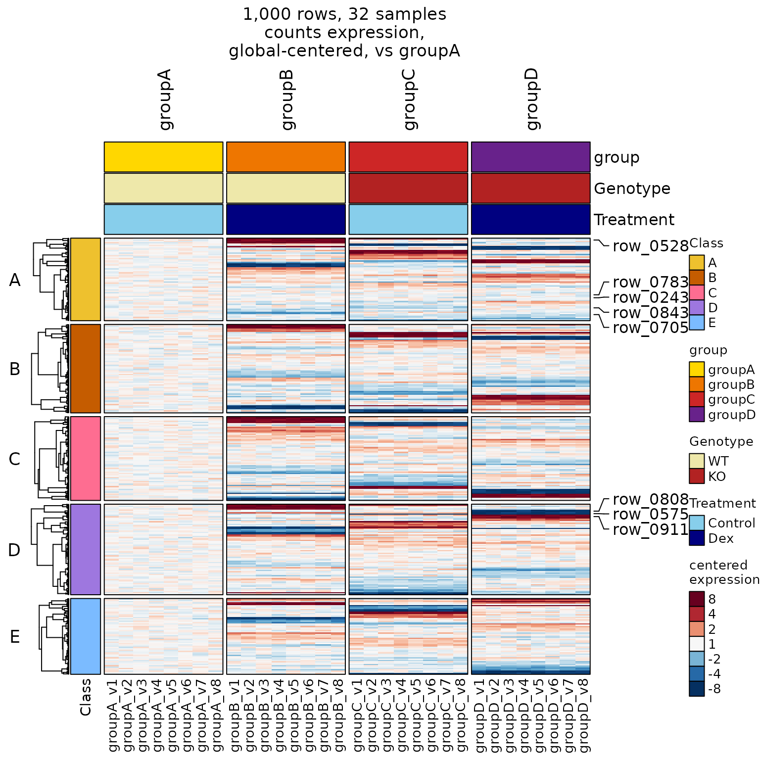
Customize Column Labels
- Many labels options can be customized: size, color, fontface
- This example shows how to change the color
usingcolumn_names_gp, which usesgrid::gpar().
- This example shows how to change the color
# customize column label fonts using column_names_gp
column_bold <- ifelse(
   SummarizedExperiment::colData(se)$group %in% "groupA",
   2, 1);
column_colors <- sample_color_list$group[
   as.character(SummarizedExperiment::colData(se)$group)
]

hm8 <- heatmap_se(se,
   controlSamples=use_controlSamples,
   control_label="vs groupA",
   column_names_gp=grid::gpar(
      col=column_colors,
      font=column_bold
   ),
   column_split="group",
   row_split="Class",
   rowData_colnames="Class",
   sample_color_list=sample_color_list)

ComplexHeatmap::draw(hm8,
   column_title=attr(hm8, "hm_title"))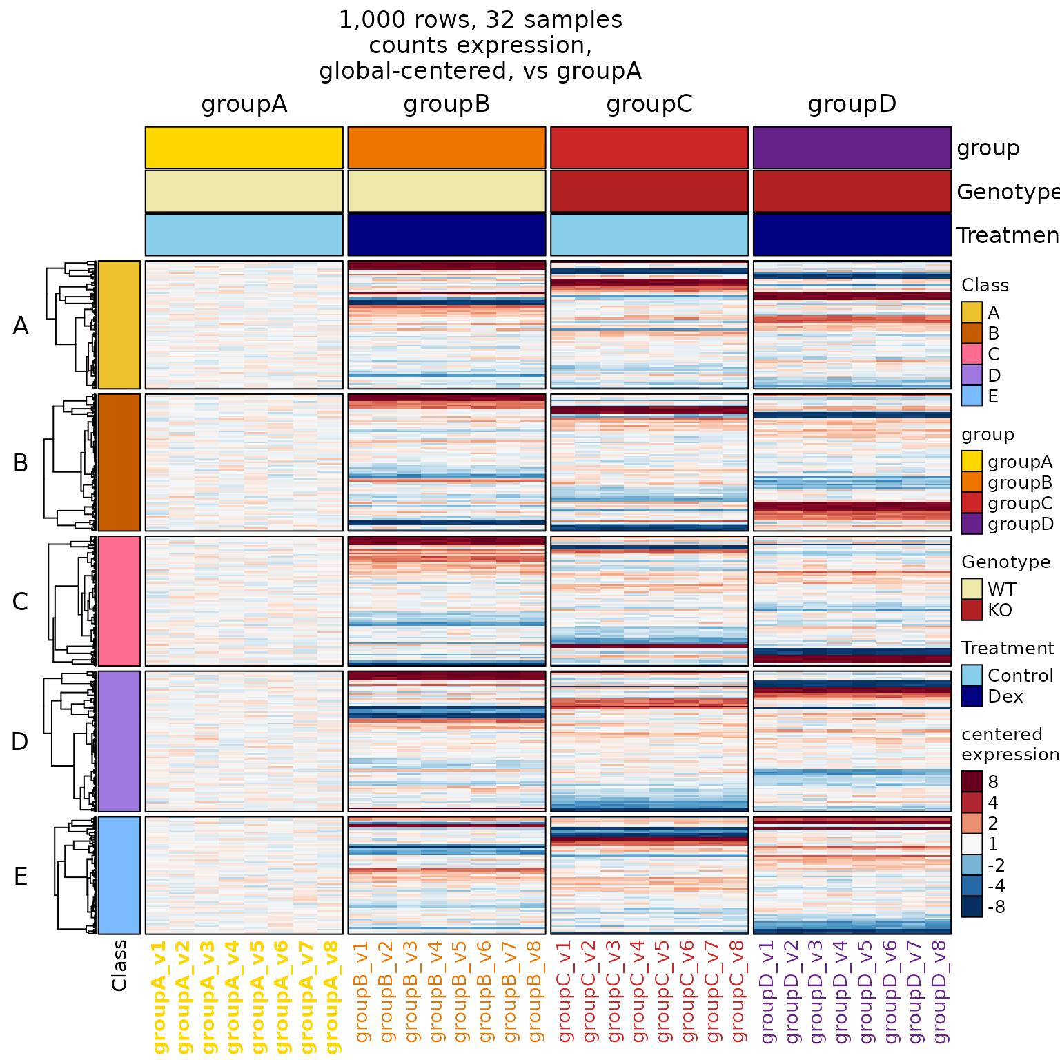
Create a Correlation Heatmap
- Just add
correlation=TRUE.- Any heatmap becomes a correlation heatmap,
using the same centered data as displayed
in the normal heatmap. - Centered data are used with
cor(), which is
the recommended way to calculate correlation values.
- It answers “What correlates using difference-from-average?”
- Any heatmap becomes a correlation heatmap,
-
cluster_columns=TRUEenables column clustering. - Remove
column_splitto allow unsupervised clustering.
# correlation=TRUE, any heatmap becomes a sample correlation heatmap
hm8corr <- heatmap_se(se,
   correlation=TRUE,
   apply_hm_column_title=TRUE,
   controlSamples=use_controlSamples,
   control_label="vs groupA",
   column_names_gp=grid::gpar(
      col=column_colors,
      font=column_bold),
   cluster_columns=TRUE,
   sample_color_list=sample_color_list)

ComplexHeatmap::draw(hm8corr)