5.1 Figure Boosting
One of the best hobby activities while developing Venndir has been "figure sniping", which is loosely translated, "Can Venndir make that figure?"
There are two main motivations:
- Can it be done? A test of creativity, a test of wills.
- Can it be done better? Dare we try?
There are plenty of graphics tools with which someone could just create their own Venn diagram "by hand", such as Inkscape, Adobe Illustrator, Microsoft Powerpoint. For me, the fewer things I do "by hand" the better. To be completely frank with myself, the fewer things I don't want to do by hand the better. Also me: Somtimes I do what I want to do.
The first example was shown in Figure 3.21, to recreate part of the nice Venn diagram in (Salybekov et al. 2021) Figure 2.
5.1.1 Me - Electron
This example is straighforward, using a fun post on Reddit r/physicsmemes (u/ScienceNerd42 2022). The person "Me" and an "Electron" both start behaving differently when observed. This example demonstrates some of the basics of re-creating a figure, in order to make a similar figure, or to enhance the concept of the figure.
The labels are clear, the colors are easily approximated.
The font looks like Times, so fontfamily='serif' should suffice.
The center wording is best represented as one item label,
split across multiple lines using newline '\n' character.
Figure 5.1 shows the outcome, relatively quick and easy!
Two more options are shown on the bottom row. The first (bottom left)
customizes the innerborder and outerborder. The second calls
modify_venndir_overlap() to highlight the center region.
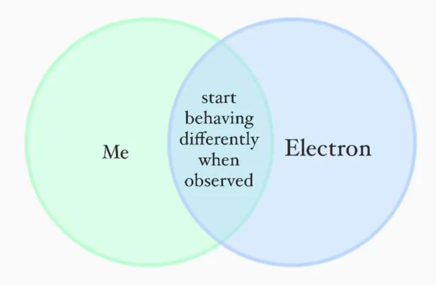
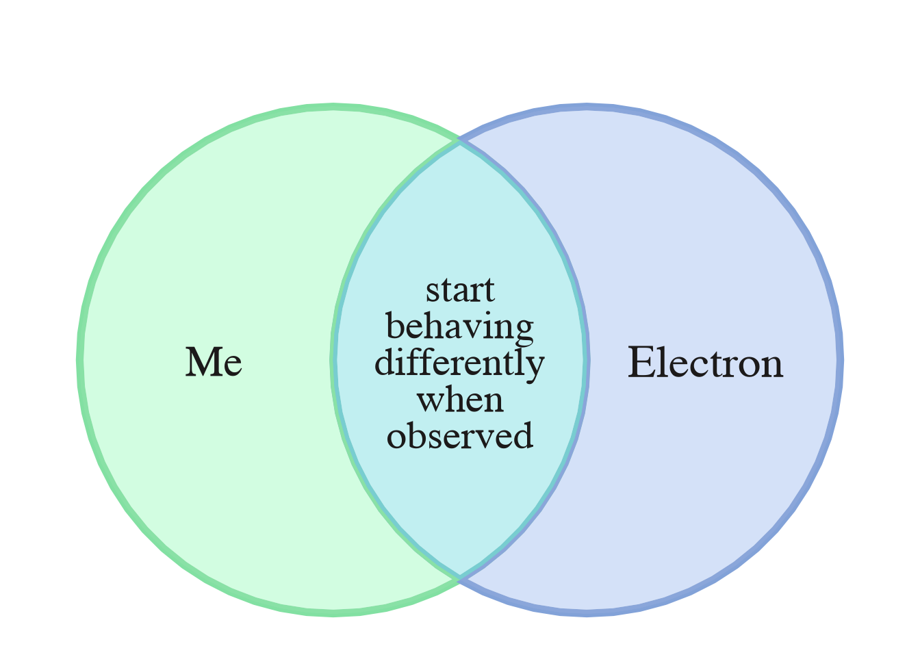
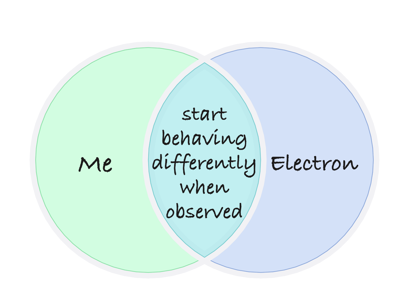
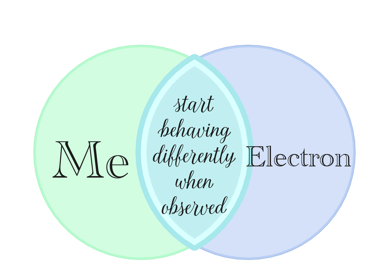
Figure 5.1: Target figure from r/physicsmemes (top left), re-created (top right), with two alternatives (bottom).
5.1.2 eulerGlyphs
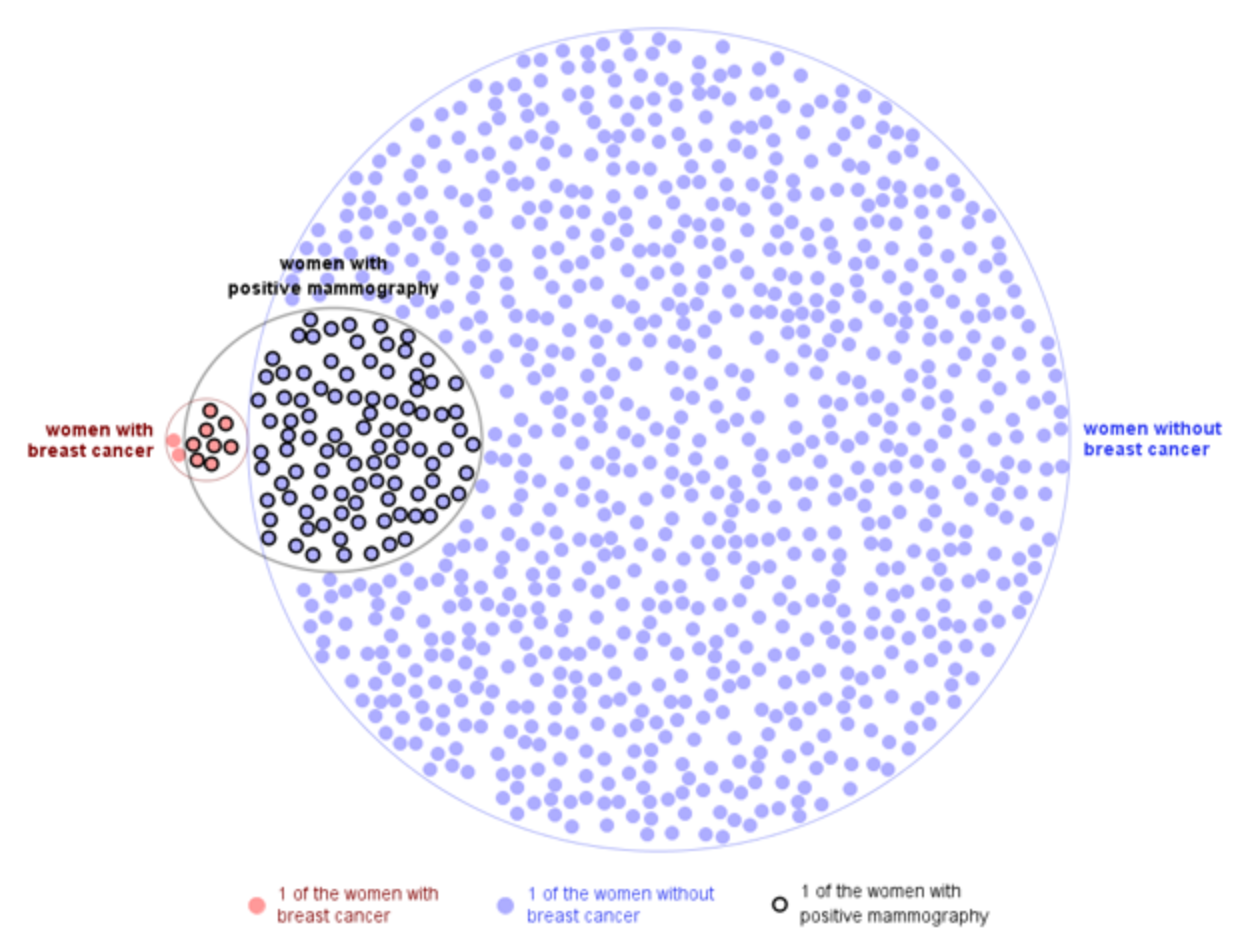
Figure 5.2: Target diagram from eulerGlyphs.
Figure 5.2 shows a fantastic figure created by eulerGlyphs (Micallef, Dragicevic, and Fekete 2012), an application designed to create proportional Euler diagrams. The data represents breast cancer screening statistics, and is a common reference dataset to study the visual perception of statistics.
A brief summary of the data follows:
- 10 out of 1,000 women age 40 have breast cancer.
- 8 of every10 women with breast cancer got a positive test result.
- 95 of every 990 women without breast cancer got a positive test result.
Figure 5.3 shows the initial attempt, using
overlap_type="agreement", then visualizing items with only the
sign, which for agreement uses '=' the equals sign. Items are
rotated with jitter_degrees to provide some visual randomness.
mammo_counts <- c(
   wob=895,
   wwbc=2,
   "wob&wwpm"=95,
   "wwbc&wwpm"=8)
mammo_list <- counts2setlist(mammo_counts)
mammo_labels <- c(
   wob="women without\nbreast cancer",
   wwbc="women with\nbreast cancer",
   wwpm="women with\npositive mammography")
mammo_colors=c("#AEAEFF", "#FF9D9D", "#896699")
v_mammo <- venndir(mammo_list,
   overlap_type="agreement",
   poly_alpha=0.3,
   set_colors=mammo_colors,
   setlist_labels=mammo_labels,
   xyratio=0.4,
   show_labels="Ni",
   show_items="sign",
   jitter_degrees=45,
   item_buffer=-0.01, width_buffer=0.05,
   item_cex=c(1, 1, 1, 1, 1),
   segment_distance=0.02,
   expand_fraction=c(-0.1, -0.2, -0.1, 0),
   rotate_degrees=180,
   draw_legend=FALSE,
   proportional=TRUE)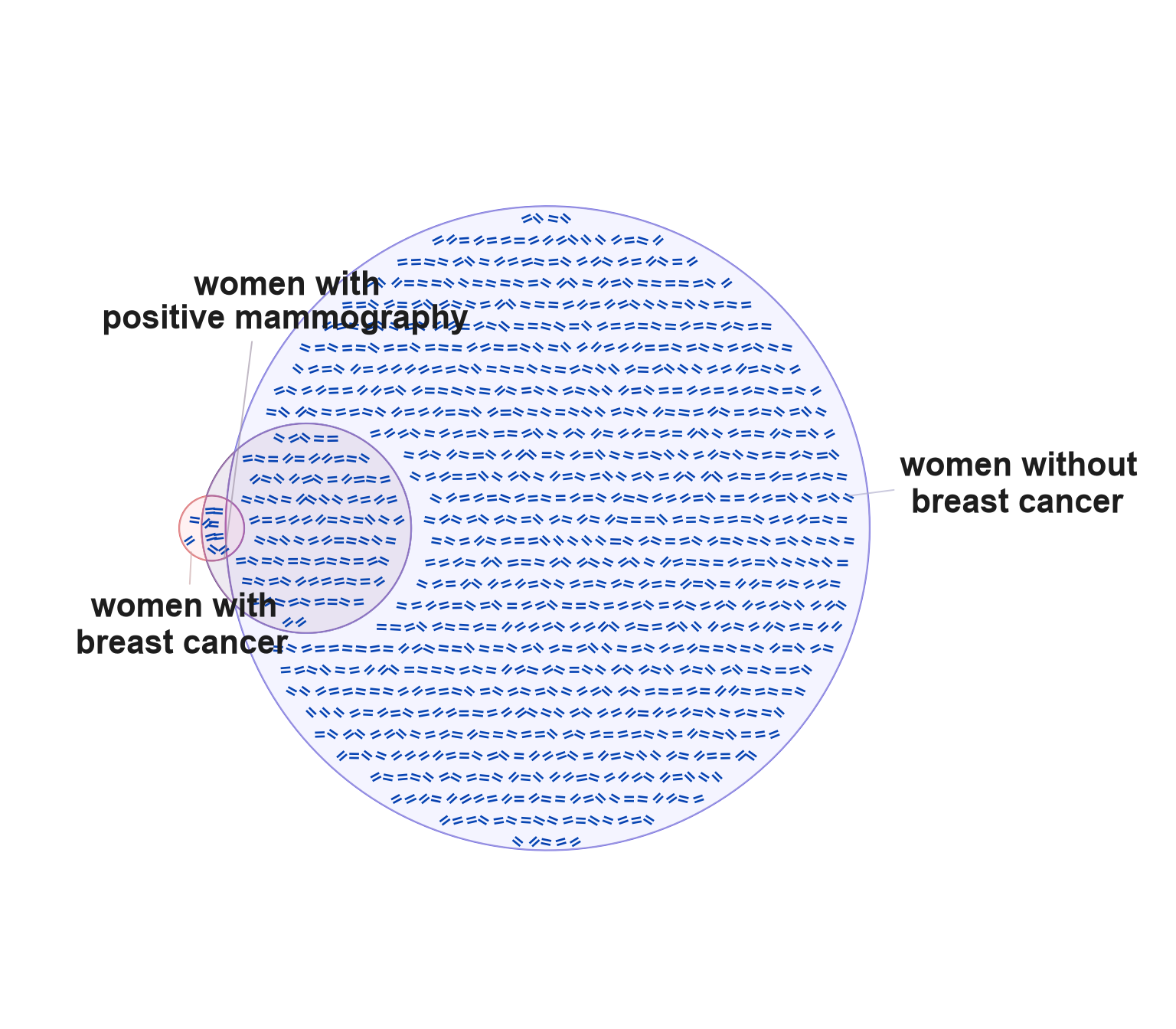
Figure 5.3: Initial attempt at re-creating the EulerGlyphs figure.
The first pass fills the space with '=' symbols,
rotates the eulerr output, and placed the circles quite well.
The argument xyratio=0.4 placed the '=' symbols closer
together than default.
Another approach could improve the figure, using a
the Unicode 'U+25CF' filled circle with
the method described in Customize the Symbols.
This symbol would match the font color, which can be edited
to match the source figure.
(In a pinch, the items themselves could be edited in the Venndir object:
v_mammo@label_df$items. The items could be replaced with the Unicode
symbol as one option.)
Figure 5.4 shows Unicode filled circles, and colors assigned to approximate the colors in eulerGlyphs. The set labels are nudged.
curate_df3 <- get_venndir_curate_df();
agg3 <- which(curate_df3$from %in% "agreement")
curate_df3[agg3, "sign"] <- "\u25CF";

# create a new Venndir
v_mammo3 <- venndir(mammo_list,
   do_plot=FALSE,
   circle_nudge=list(
      wwbc=c(-1.8, 0),
      wwpm=c(-1.6, 0)),
   innerborder.lwd=1, outerborder.lwd=1,
   overlap_type="agreement",
   poly_alpha=0.1,
   set_colors=mammo_colors,
   curate_df=curate_df3,
   setlist_labels=mammo_labels,
   xyratio=0.6,
   fontfaces=list(overlap="plain"),
   show_labels="Ni",
   show_items="sign",
   segment_buffer=-0.05,
   jitter_cex=0, jitter_color=0,
   font_cex=0.8,
   item_buffer=-0.02,
   item_cex=c(1, 1, 1, 1, 1) * 1,
   segment_distance=0.02,
   rotate_degrees=180,
   draw_legend=FALSE,
   proportional=TRUE)

# edit the label colors
v_mammo3@label_df["wob", "color"] <- "blue1";
v_mammo3@label_df["wwbc", "color"] <- "red2";
v_mammo3@label_df["wob.agreement", "color"] <- mammo_colors[1];
v_mammo3@label_df["wob&wwpm.agreement", "color"] <- "royalblue";
v_mammo3@label_df["wwbc&wwpm.agreement", "color"] <- "#DD6666";
v_mammo3@label_df["wwbc.agreement", "color"] <- mammo_colors[2];

# nudge labels
v_mammo3n <- nudge_venndir_label(v_mammo3,
   label_location="outside",
   offset_list=list(wwbc=c(0.0, 0.03),
      wwpm=c(-0.07, 0.1),
      wob=c(0, -0.06)))

# visualize
plot(v_mammo3n,
   jitter_color=0, width_buffer=0.02,
   L_lo=80, L_hi=85, C_floor=50,
   expand_fraction=c(-0.1, -0.10, -0.1, -0.05),
   innerborder.lwd=0, outerborder.lwd=0.7)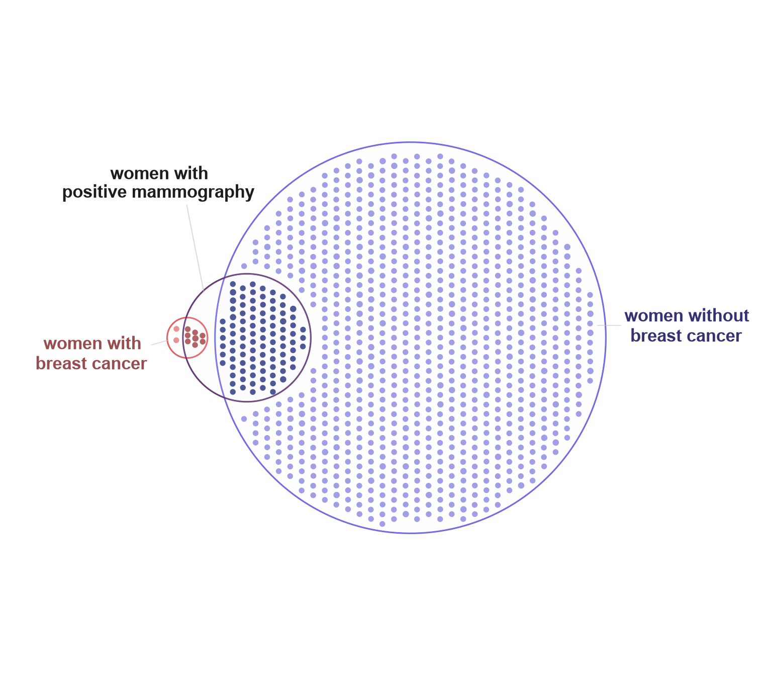
Figure 5.4: Second attempt at the EulerGlyphs figure. It already looks cleaner.
Both previous attempts showed "quick and easy" approximations, however the spirit of Figure Boosting is to re-create the image as closely as possible.
The eulerGlyphs figure used points colored to convey true breast cancer status, with black border to indicate a positive mammography test result. To mimic this effect requires using proper points.
The steps required:
- Create the Venndir object without item labels.
- Nudge the set labels, apply custom colors.
- Extract the
JamPolygonobject. - Call
label_fill_JamPolygon()for each overlap. - Render
grid::pointsGrob()in the correctviewport.
Steps 1 and 2 are shown below:
# create a new Venndir
v_mammo4 <- venndir(mammo_list,
   do_plot=FALSE,
   circle_nudge=list(
      wwbc=c(-1.4, 0),
      wwpm=c(-1.6, 0)),
   innerborder.lwd=1, outerborder.lwd=1,
   overlap_type="agreement",
   poly_alpha=0.1,
   set_colors=mammo_colors,
   setlist_labels=mammo_labels,
   fontfaces=list(overlap="plain"),
   show_labels="N", keep_items=TRUE,
   segment_buffer=-0.05,
   font_cex=0.8,
   segment_distance=0.02,
   rotate_degrees=180,
   draw_legend=FALSE,
   proportional=TRUE)
# edit the label colors
k <- c("wob", "wwbc")
v_mammo4@label_df[k, "color"] <- c("blue", "red")
# nudge labels
v_mammo4n <- nudge_venndir_label(v_mammo4,
   label_location="outside",
   offset_list=list(wwbc=c(0.01, 0.045),
      wwpm=c(-0.09, 0.06),
      wob=c(-0.01, -0.06)))
The internal function label_fill_JamPolygon() defines
coordinates for item labels inside a JamPolygon.
The example iterates each overlap region that contains items,
then stores item coordinates to use later.
The point fill color and border are defined for each region as well.
# JamPolygon
v_items <- jamba::rmNULL(v_mammo4@label_df$items)
v_colors <- mammo_colors[c(1, 2, 1, 2)];
v_borders <- c(NA, NA, "black", "black")
v_buffers <- c(0.01, -0.2, 0, -0.15)
xy <- jamba::rbindList(lapply(seq_along(v_items), function(i){
   which_jp <- match(gsub("[|].+", "", names(v_items)[i]),
      names(v_mammo4@jps))
   xy <- label_fill_JamPolygon(jp=v_mammo4@jps[which_jp],
      width_buffer=0.01,
      buffer=v_buffers[i], xyratio=0.5,
      labels=seq_along(v_items[[i]]))$items_df;
   xy$color <- v_colors[i];
   xy$border <- v_borders[i];
   xy;
}))
Finally, the item coordinates are used with grid::pointsGrob()
with some visual noise added by rnorm() for visual flair.
Figure 5.5 shows the result from the final
steps, drawing the points in the correct viewport.
# plot the Venndir
v_mammo4p <- plot(v_mammo4n,
   expand_fraction=c(-0.1, -0.10,
      -0.1, -0.05))
# extract the viewport adjustments
vp <- attr(v_mammo4p, "viewport");
adjx <- attr(v_mammo4p, "adjx");
adjy <- attr(v_mammo4p, "adjy");
# create pointsGrob
set.seed(123);
pts <- grid::grid.points(
   x=adjx(xy$x + rnorm(1000)/6),
   draw=FALSE,
   y=adjy(xy$y + rnorm(1000)/6),
   pch=21,
   gp=grid::gpar(col=xy$border,
      fill=xy$color, cex=0.6),
   vp=attr(v_mammo4p, "viewport"),
   default.units="native")
# draw inside the viewport
grid::pushViewport(vp)
grid::grid.draw(pts)
grid::popViewport()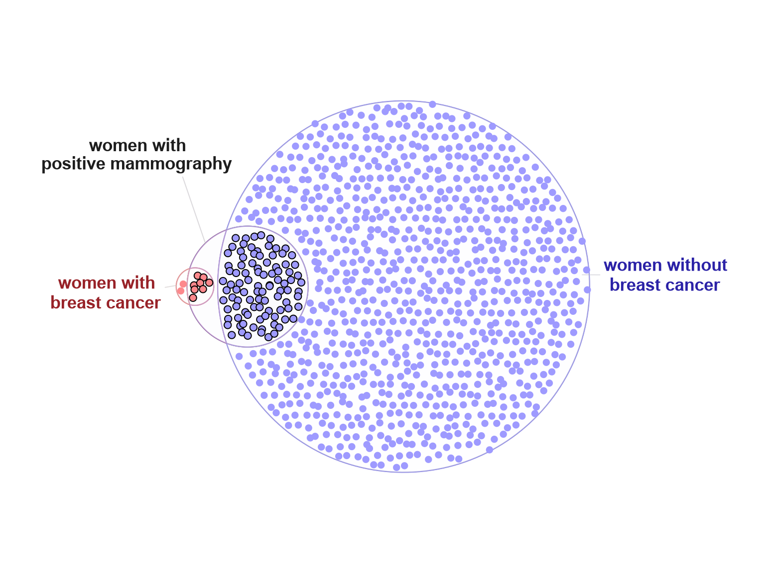
Figure 5.5: Third attempt at re-creating the eulerGlyphs figure.
Tips:
- The
Venndirobject must be plotted in order to define theviewport, since it depends upon theexpand_fractionadjustments. - The viewport must be pushed before drawing points.
The result turned out better than expected, and the workflow could be re-used for other datasets.
Can it be improved?
While creating the figure, the first question that arose:
"How many points are in each region?"
In truth, it took some effort to discover these values, despite
being the focal point of the study (and the study about the study).
Figure 5.6 shows some potential improvement, labeling each section with the number of points.
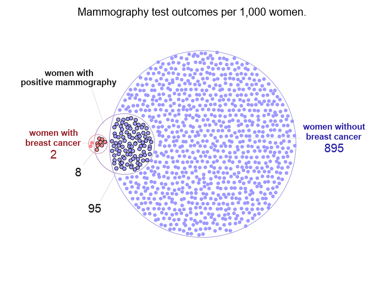
Figure 5.6: Update which labels the number of points in each region. The title reveals each point represents one woman tested per 1,000 in the study.